|
Hello friends! I thought it would be fun to share a little bit about my journey with Procreate today. Why I use it, how it fits into my workflow, what I like and don't like about it, as well as some workarounds that I’ve found helpful. There are a lot of options out there when it comes to creating artwork for illustration/licensing and it’s easy to get caught up in the FOMO of what everyone else is doing, so I wanted to share this caveat first... Procreate is just one of many great tools out there. From traditional media to digital, raster to vector, there is a place for all of it. While learning how other artists work can be fun and inspiring, remember that the best way to create artwork is not what I or anyone else may suggest. It's whichever way works for you and expresses your artistic vision the most accurately. And while we're here, I feel obliged to say that this post does not contain affiliate links. I'm just sharing for the fun of it! That being said, let's talk Procreate! 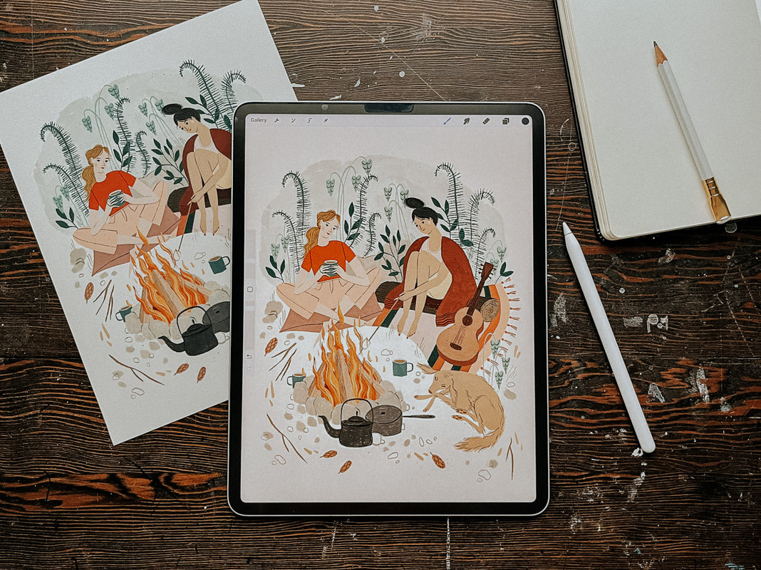 Why I started working in Procreate My working style has gone through a lot of iterations over the years. Like most creatives, I love playing with new tools and collecting all the cool art supplies! But that can also get overwhelming. I’m easily bogged down by too many choices and visual clutter. I've learned that I personally do better with fewer choices, and that my work will be better if I can focus on improving at one or two techniques at a time rather than being mediocre at everything. I used to hand paint all of my work, scan it and edit it in Photoshop. I use Photoshop because it’s what I learned in art school and so I was already somewhat familiar with it, although, to be honest, most of the PS tools that I actually use I learned through Google search. I did learn Adobe Illustrator, but while I love what other artists are able to create with it, it never felt quite right to me in terms of my own artwork. I started getting more work as an illustrator just after my daughter was born but it became very difficult to work at all at that point. She was not a good sleeper and so working during nap time was a bit of a joke. Around this time Procreate started to become popular and I thought it could be a good option for me. It gave me a lot of freedom to work while also being at home with my young children. I didn’t have to worry about finding time to paint, scan and edit my work, clean up my supplies, or keep my paint covered brushes away from grabby hands. So I decided to go for it. How I use Procreate It took me quite a long time from the point of first using Procreate to where I became comfortable enough to use it as my main tool. Over two years! At first I just used it to create my rough sketches and then I would hand paint my final artwork. But, as I said, it became more and more difficult to keep up, especially when I eventually had two non-napping kids at home with me all day. I’ve also come to the conclusion that I’m just a naturally slow person and it takes me twice as long to do anything. Eventually, I decided that the only way I was going to be able to create art at a steady pace was if I was working mostly on the Ipad. Getting used to working more fully in Procreate was, as with most things, a matter of practicing and creating lots of work. I spent a lot of time experimenting with different brushes until I found a few that worked best for me. These ones are my current favourite: bardotbrush.com/product/artists-pastels/ As of this writing my process usually looks like this:
Dislikes While there are a lot of things that I love about Procreate, there are a few things that I don’t like. In particular, I’ve always struggled with image degradation and limited layers. I can tend to be on the stubborn side and these two things irritated me so much in the beginning that they are the main reason it took me so long to come around to using Procreate more fully. With practice and some research I was able to figure out some workarounds and I find now that a little bit of inconvenience is worth it when I consider all of the benefits it’s giving me. Image degradation This was one of the biggest issues that I had/have with Procreate and I feel like it doesn’t really get talked about much, maybe I’m wrong on that? Every time something gets moved around or adjusted in Procreate the image quality of that object will degrade slightly. So, for example, if you’ve drawn final artwork for a pattern and are then attempting to build that pattern within Procreate, moving each motif around and fiddling to get them in just the right place, you’re going to end up with blurry artwork after a few moves. It’s pretty annoying. To work around this I always create a fairly accurate rough sketch first, even if I’m creating a pattern, I’ll create the repeat in sketch form first and get everything where I want it to be before creating the final artwork. When I’m creating the final artwork I try not to move anything. If something does need adjusting, I'll do that at the end once I’ve exported everything into Photoshop. Then I can freely move things around without any issues. If I really need to move something in the moment then I’ll create a duplicate and move that into the correct place and then replace it with the original in Photoshop later. Side note: Creating a rough sketch first is something you’ll need to be doing anyways if you’re going to be creating commissioned work for clients so it’s a good habit to get into.
Limited layers If you work in rasters then you know it’s important to work as large as possible. I like to create most of my work at 600 dpi, just to be safe (I’ve never had an issue with needing anything larger). But an 8x10 canvas in Procreate only has so many layers, and being used to working in Photoshop I liked to have every single thing on its own layer. It's a bit clunky, but to work around this, once I reach my layer limit, I duplicate my file and merge all of the layers in the duplicate file together. Then I'll continue to work on new layers in the duplicate file. If I'm working on something very complex I might do this a few times. Once I'm done, I'll combine all of the layers from the original Procreate file and each duplicate file into one file in Photoshop and remove the merged layers (in PS select all layers and then drag and drop them into the new file). It sounds more complicated than it actually is! I’ll also sometimes combine layers that have items that don’t touch each other and separate them later in Photoshop, but that can be a bit tedious. Lately, I’m trying not to be as picky about having everything on a separate layer because I’ve rarely had to go back and make adjustments. If I feel it’s safe to combine layers then I will, knowing that I can always pull off some Photoshop magic to make adjustments if I really need to. Likes Time saving Working in Procreate saves me a lot of time because I’m able to be portable and work almost anywhere as opposed to being stuck at my desk painting, scanning and editing my artwork. Not only does this free up my time, It also means that I'm spending less time on each particular piece while still earning the same amount of money from it, so I end up earning more per hour worked. Freedom to mess up Along with the freedom of portability that I just mentioned, I also feel more free in my drawing itself. When hand painting I was often afraid of making mistakes and ruining hours of work. With Procreate I have been able to loosen up and try new things without that worry. It’s allowed me to grow my skills and my confidence. Like/Dislike Cost While an iPad is a big investment, the actual Procreate app is a very small one time fee of around $20 depending on where you live, which is incredible considering the value it provides and in comparison to other programs such as the Adobe suite. I’m also saving a ton of money that I’d normally be spending on art supplies. That one is both a pro and a con! I use my iPad for so much more than just drawing and so it has been worth it for me. I get asked this a lot so I’ll share here, if you’re considering purchasing an iPad I would prioritize screen size over storage. I export all of my work and save it in Dropbox so I don’t need a lot of storage space. The iPad that I’m using right now is a 12.9” iPad Pro. What about you? Do you have any pros and cons or general Procreate tips that you’d add to this list? Let me know in the comments below!
17 Comments
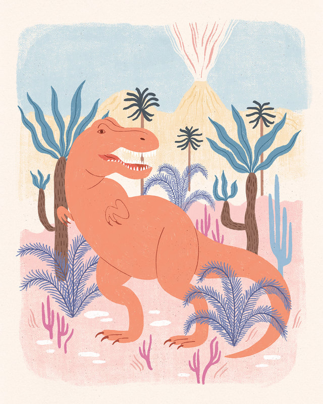
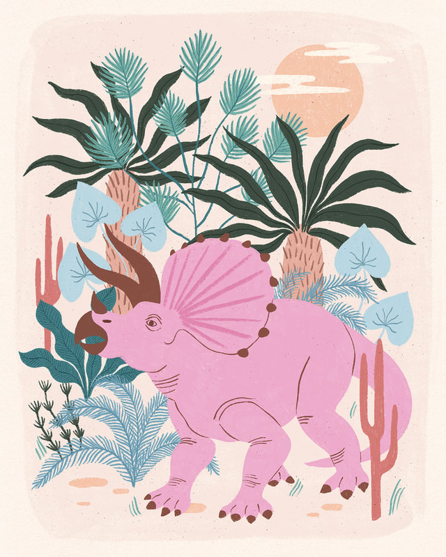
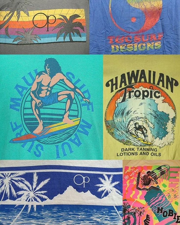
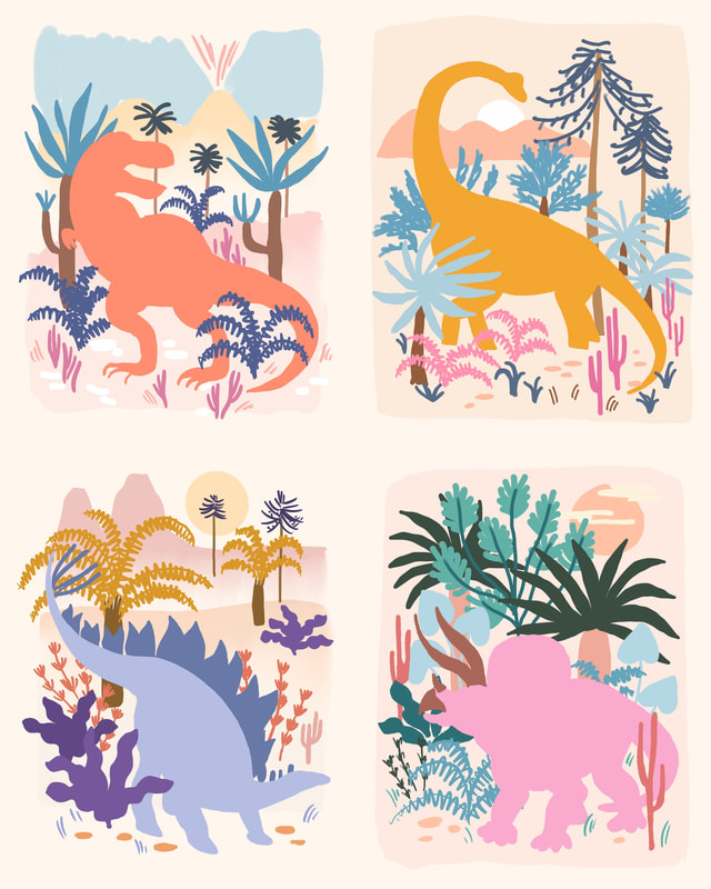
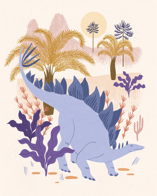
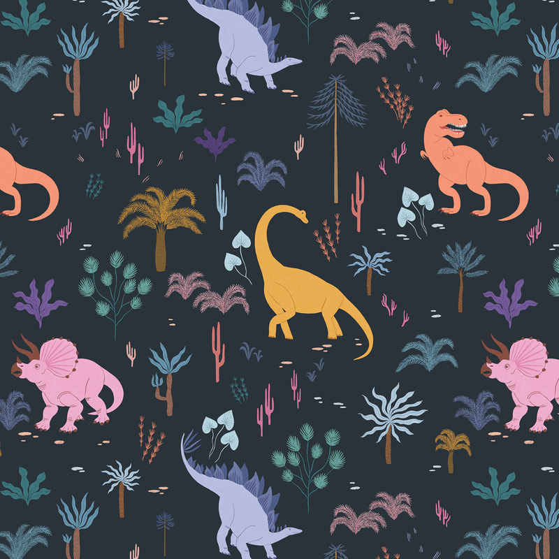
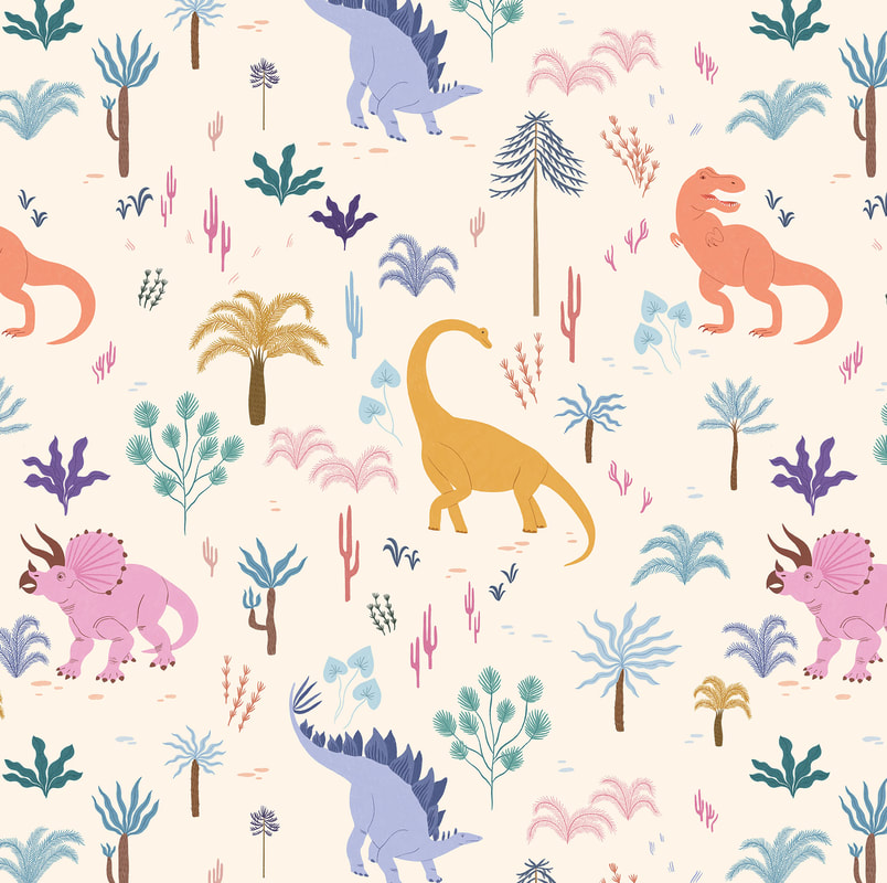
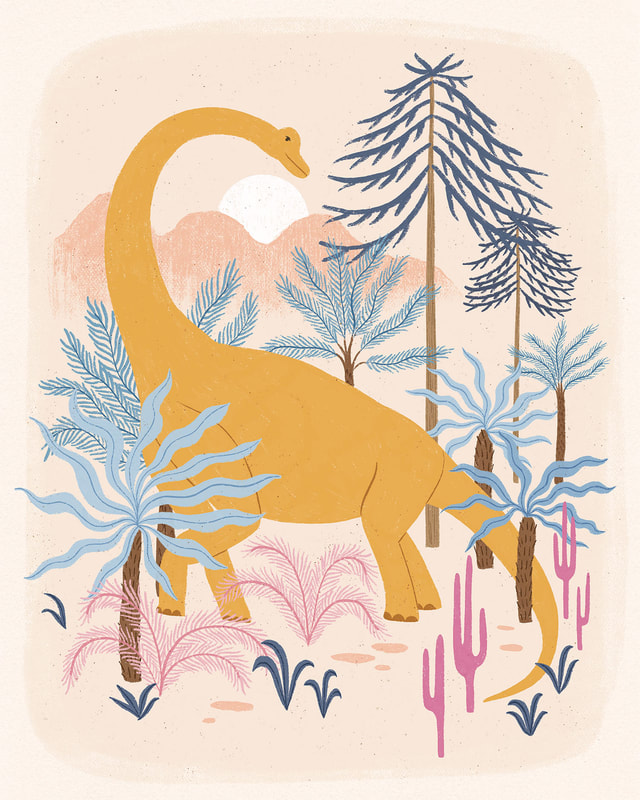
Hello friends! I’ve been busy the last few months working on a special project for my agent Jehane, Out of the Blue! Jehane gave all of her artists a series of creative briefs to work on throughout the year and now all of that work is being showcased in this fun event! For one of this year's themes, Life on Earth, I decided to step out of my comfort zone a bit and tackle a subject matter that I’ve never tried before, dinosaurs! I can’t tell you how much fun I had creating these dinosaurs. Maybe it was because the subject matter was so different and so I had no idea what to expect, but I really got into it! My inspiration for the look of this collection were the 80’s surf t-shirts of my childhood, Ocean Pacific anyone? I just couldn't stop thinking about how the slightly faded bright colours and scenic imagery would be a fun mashup with the dinosaur theme.
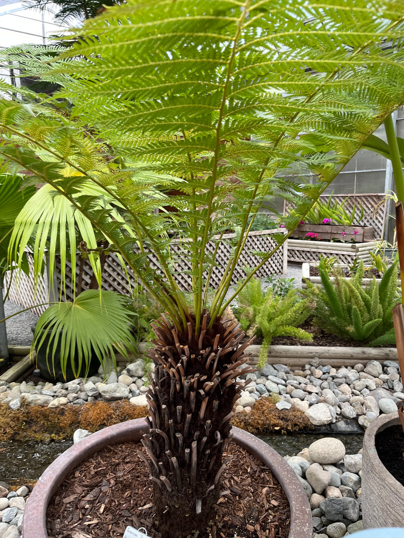
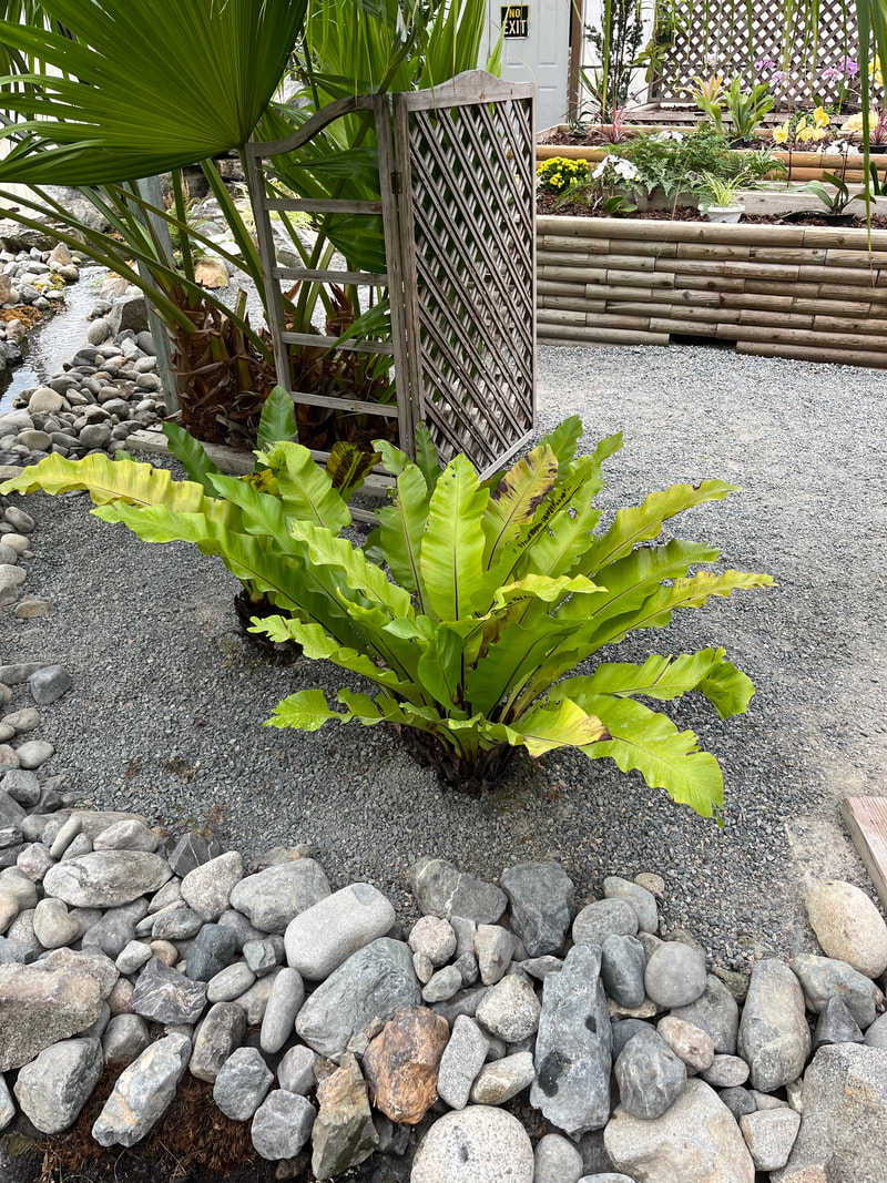
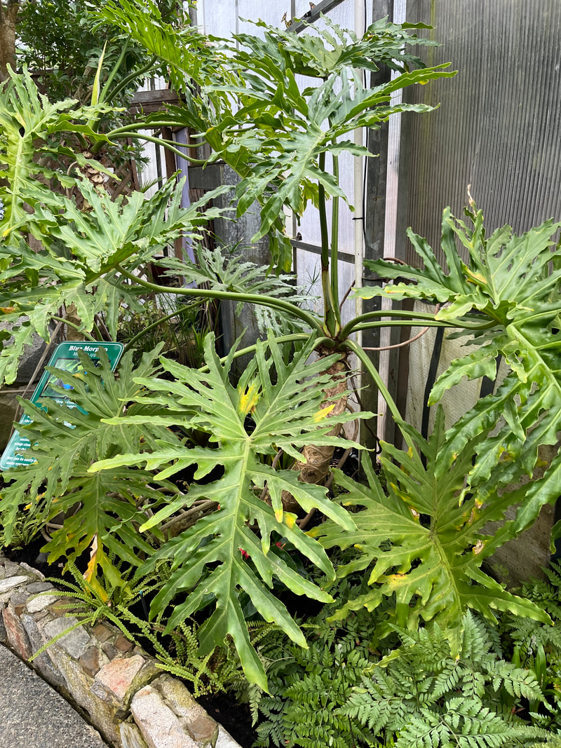
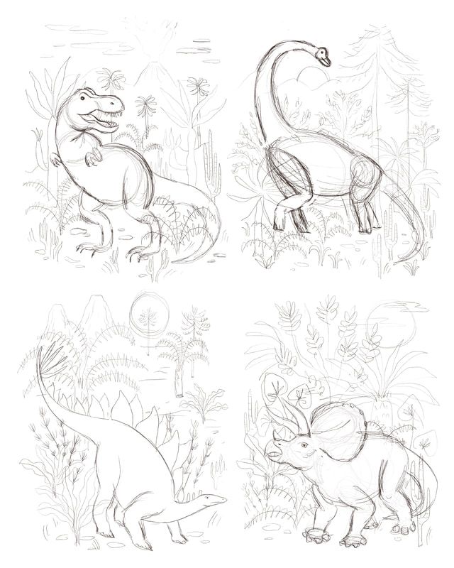
Seeing as I couldn’t go out and draw dinosaurs from life, I spent some time researching realistic looking dinosaurs and their skeletons to get a feel for what they looked like. Then I was able to draw my own versions after figuring out the general basic shapes that made up each dino. One of the most fun parts of this series was that I had no idea what my version of a dinosaur would look like. It was so interesting seeing them come together and I think they do look like they fit in with the rest of my work! I also spent some time researching plants and the type of landscape my dinos would have lived in. I even came across some prehistoric-like plants at our local Butterfly World which I was pretty excited about! It’s the little things, amiright? I live in a small town and going out to source real inspiration is a luxury. I usually end up doing most of my research online or in books. However, keeping my source material limited to realistic imagery, photographs or vintage illustration and gathering from many different places helps give me a better idea of how my subject looks while also allowing me to interpret it in my own unique way.
Because I wanted to feature a single dinosaur as the subject of each image, I sketched out all of the dinosaurs first and then positioned them on each page, trying to vary the position and direction slightly. Then I started filling in the backgrounds with bigger shapes first then smaller until I was happy with each composition individually and how they worked together as a whole. I always like to create a colour rough before I start working. I feel like it just gives me a better sense of how the colours are working together without focusing on the details too much. I wanted the colours to be simple yet varied enough to have visual interest. I decided to aim for a somewhat complementary colour palette for each image and play from there, pinks with greens, blues and purples with orangy yellows, etc. I also tried to keep the colours brighter than my normal go to colours and I was really happy with the result. Now I’m thinking that maybe I need to start incorporating more bright colours in the future!
Another reason I like to figure out my colours beforehand is that when it comes time to create the final artwork, all of the hard stuff is already figured out and so I can just create without using too much brain power. It’s easier for me to separate each stage of the process into focused work and less focused work and then I can space these stages out in the day depending on what else is going on and my energy levels. For example, if I’m tired near the end of the day or my kids are around, it's easier for me to work on final art because I don’t have to think too much, whereas I might save the planning and ideation work for the mornings when I have more energy and I’m thinking more clearly. Lastly I created a pattern to go with the collection. I have my own bizarre way of making patterns in Photoshop that has always worked for me but this time I tried using the Pattern Preview tool and it was so handy! If you haven’t tried it, it’s definitely worth experimenting with.
Thanks for following along on this little dino themed behind the scenes! If all goes well I’ll have some dino themed products to share with you soon!
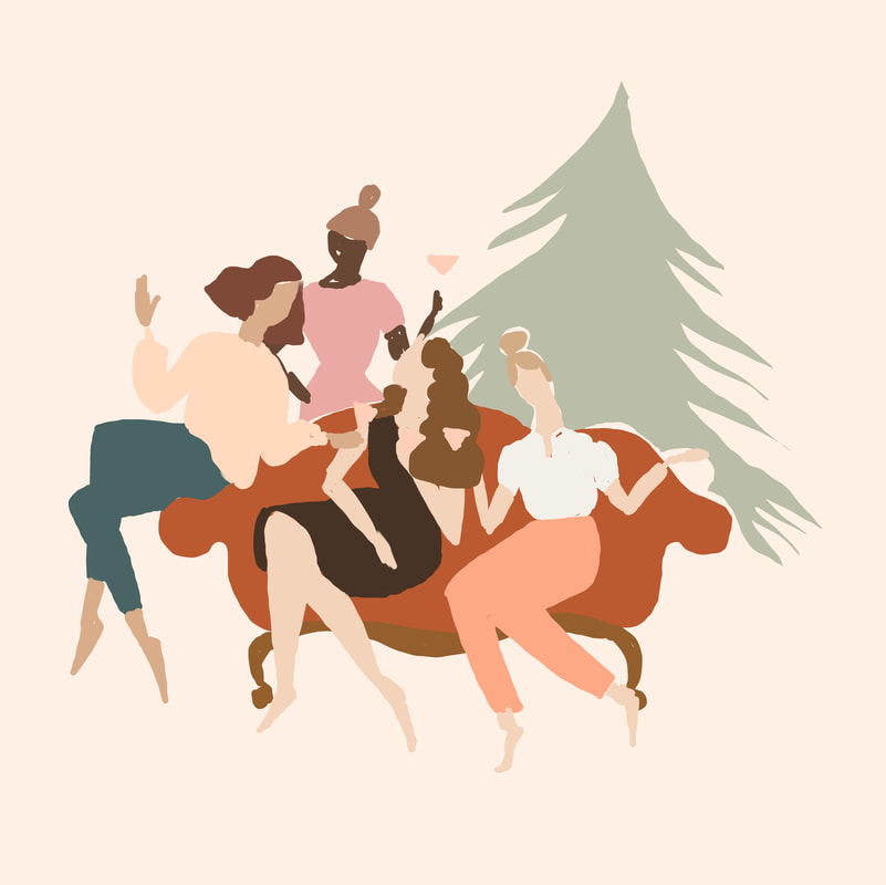
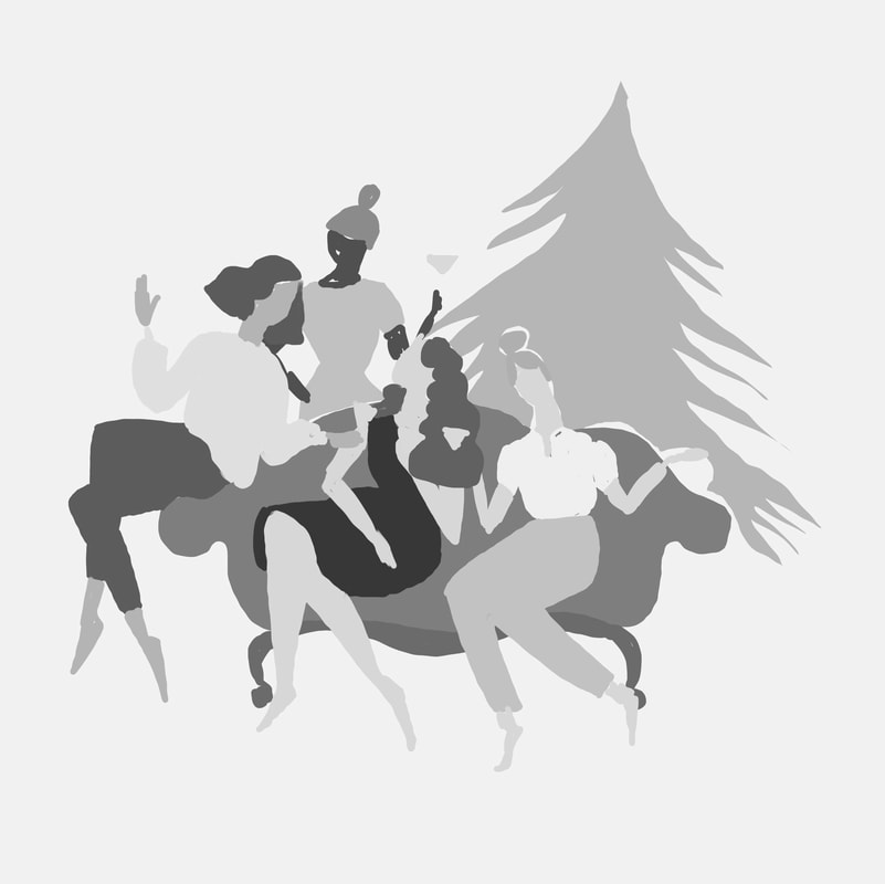
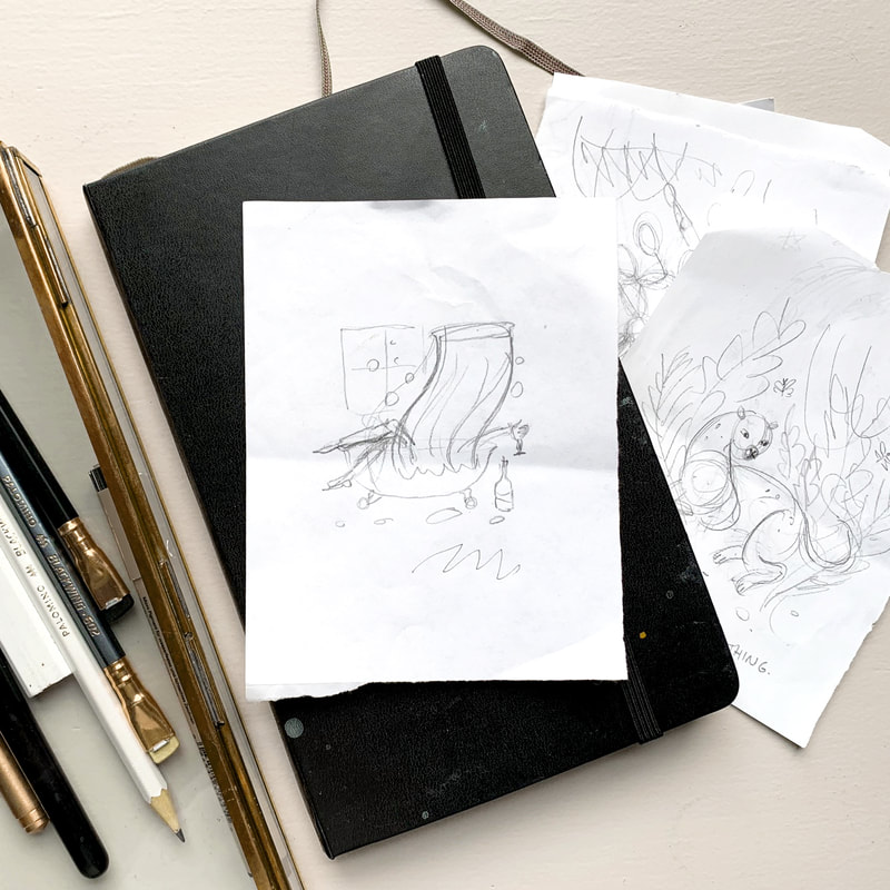
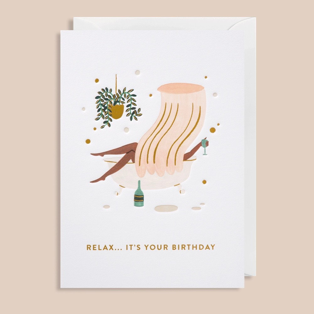
If you’re interested in learning more from me you can check out my free guides How to Draw Hands and 3 Simple Steps to Stand Out Colour Palettes, or you can scroll through past posts to see more behind the scenes! 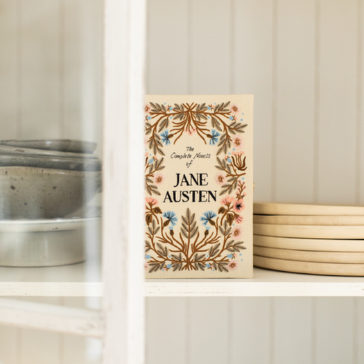 I'm so excited to finally share a new collaboration with you today! Last Spring I had the pleasure of illustrating three Jane Austen covers for French luxury brand Olympia Le-Tan. Books you might think? Nope! These are limited edition, hand embroidered clutches, book shaped purses! How fun is that! You might know that one of my big dreams is to illustrate a Jane Austen novel so of course I was over the moon for the opportunity to illustrate these beautiful clutches. The Complete Novels of Jane Austen and Sense and Sensibility are available now and I can't wait to see how the third book, Persuasion, turns out! 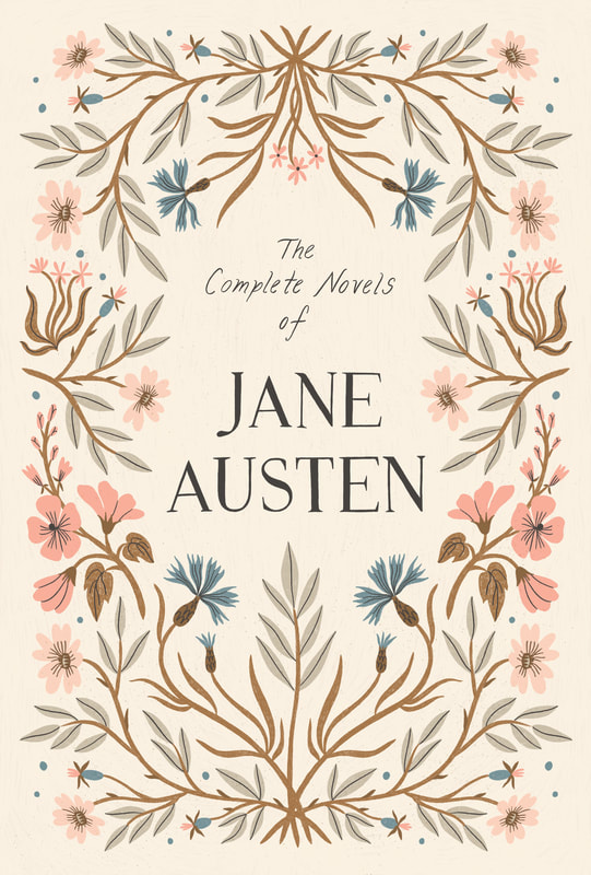 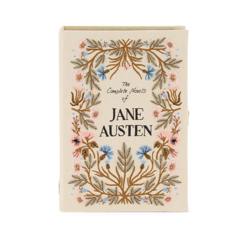 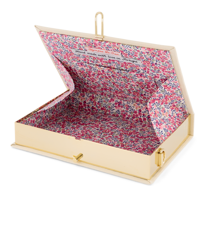 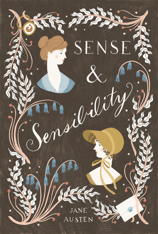 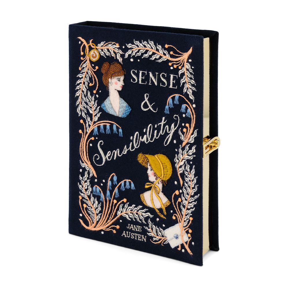 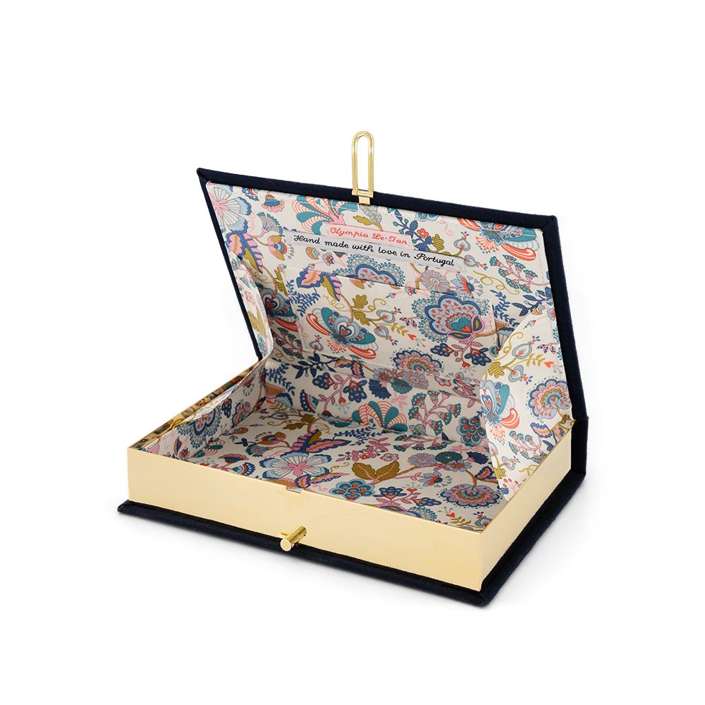 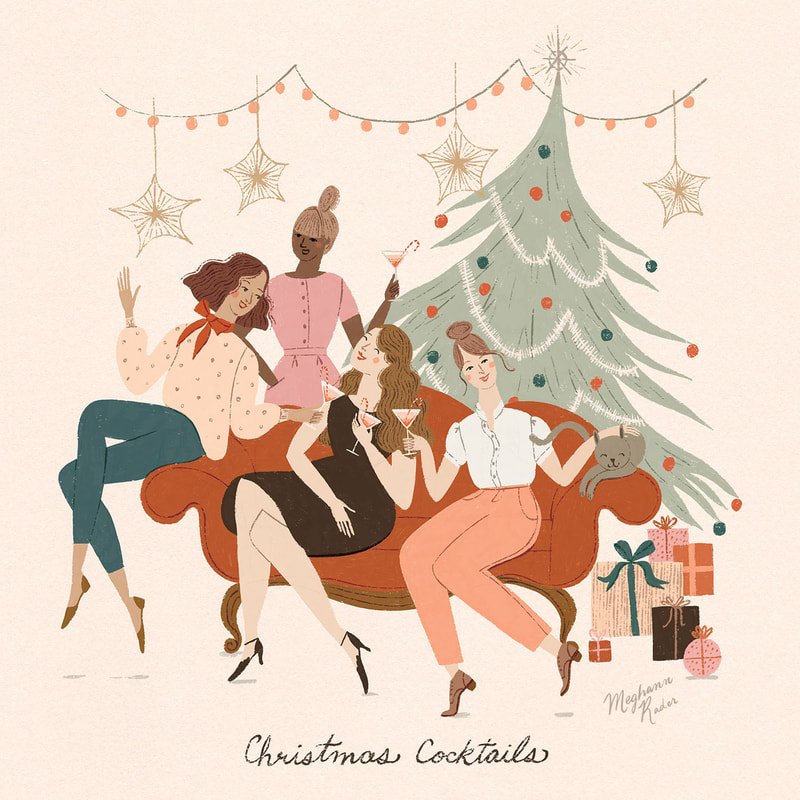 Hello Friends! Happy holidays and I hope you’re having a lovely December. This month I worked on a couple of pieces for my agent Jehane’s 12 Days of Christmas event on Instagram. I thought it would be fun to go behind the scenes and share a bit of my process for making this piece inspired by the prompt "Christmas Cocktails." As you might have already guessed, I love drawing people and so rather than focusing on just the cocktails I thought it would be more exciting to draw a cocktail party. After some time spent playing around with the layout this is the final sketch I ended up with. 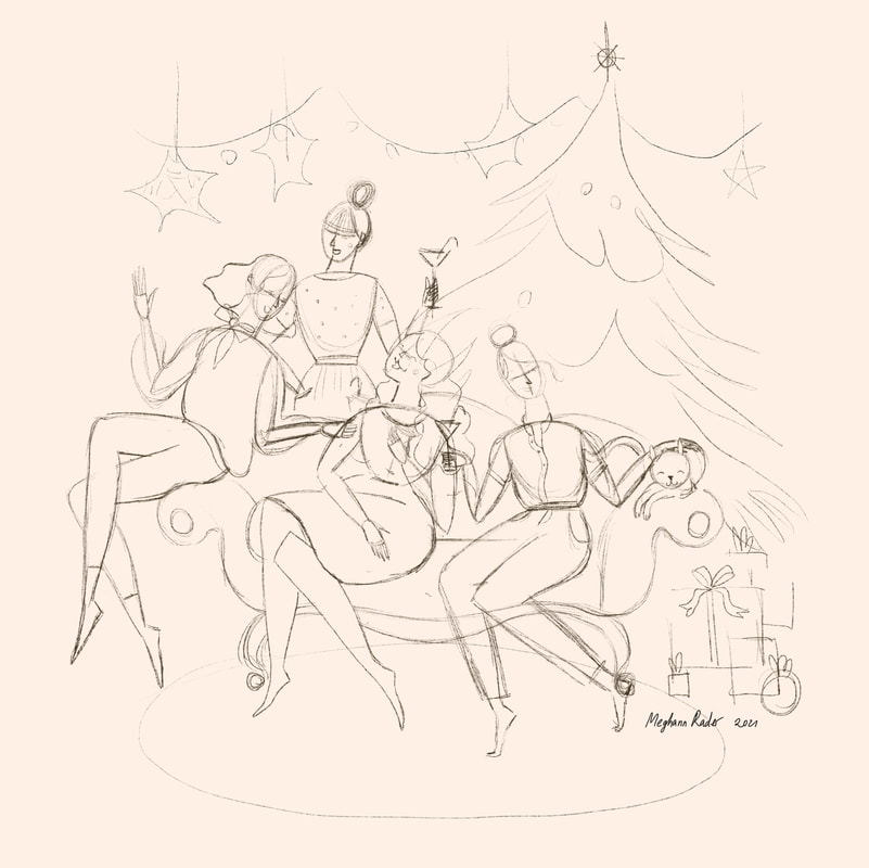 My initial rough sketch I usually change my mind a lot when it comes to colour and so I like to plan those out in advance. This helps me get a general idea of how everything is going to look as a whole and then I don’t have to spend time fiddling and changing things after the fact. I usually create a colour rough by just blocking out various colours on separate layers in Procreate and then experimenting with various combinations and making small adjustments here and there. A few things I’m looking for here are an overall balance and harmony within the colour palette and whether there is enough contrast. Contrast will help make everything pop where you want it too. Squinting is a great trick to tell if there's enough contrast but because I’m working on the Ipad I'll sometimes just desaturate my image, then I can clearly see where I need to make adjustments. In this case you can see below that I could have added more contrast between the tree and the hair of the woman petting the cat which I ended up doing in my final piece.
Once I had my colour figured out I started on my final image. If you’ve taken my Draw Simple Figures course you’ll know that I like to build up my sketches in layers, and I do the same with my final artwork as well. Usually I like to lay in all of my solid colours first and then add all of the little details last. I just find that this helps me keep the whole piece balanced. 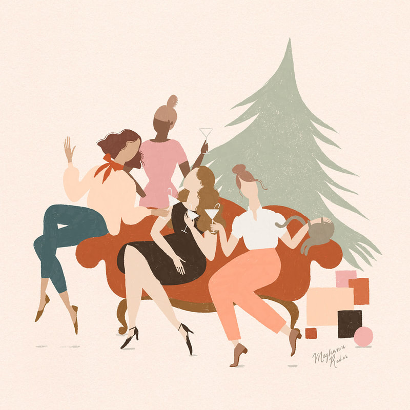 Final with just the solid colours laid down And here is the final image with all of those fun details brought in to make everything come alive! 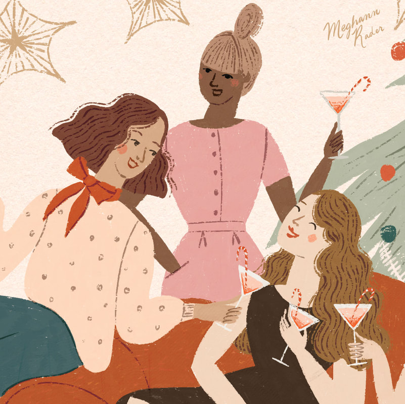 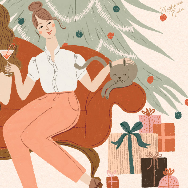
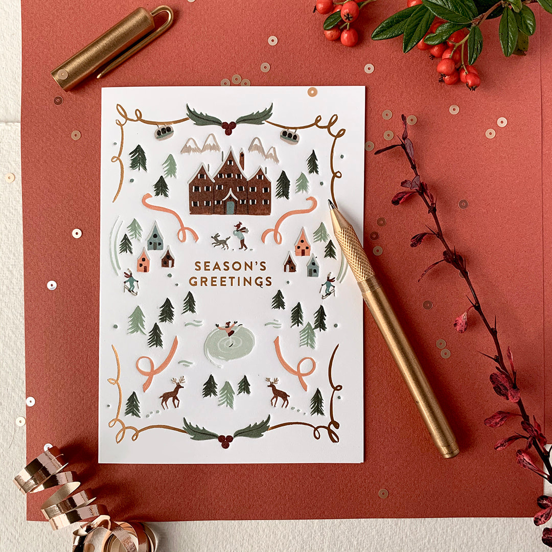
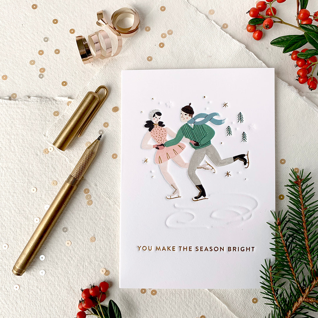
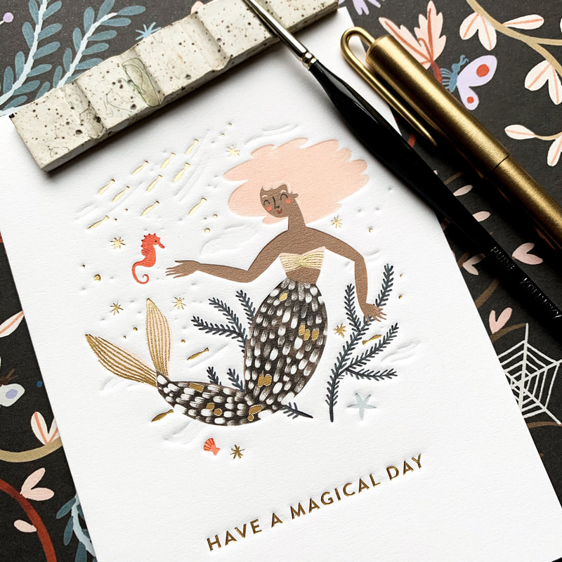
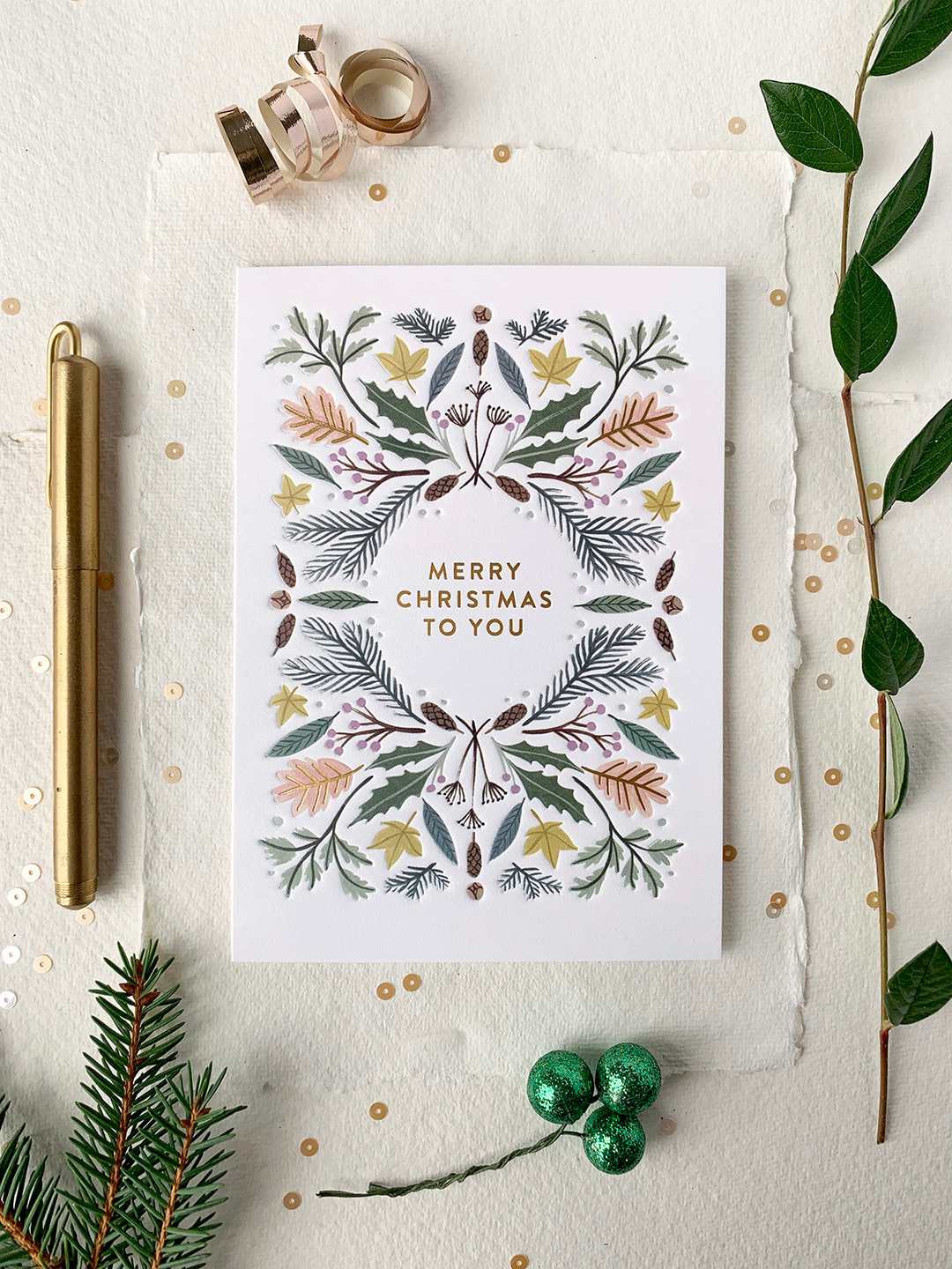
I hope you’ve enjoyed this little behind the scenes. I can't wait to share more of what I've been working on lately with you in the new year! All the best, Meghann 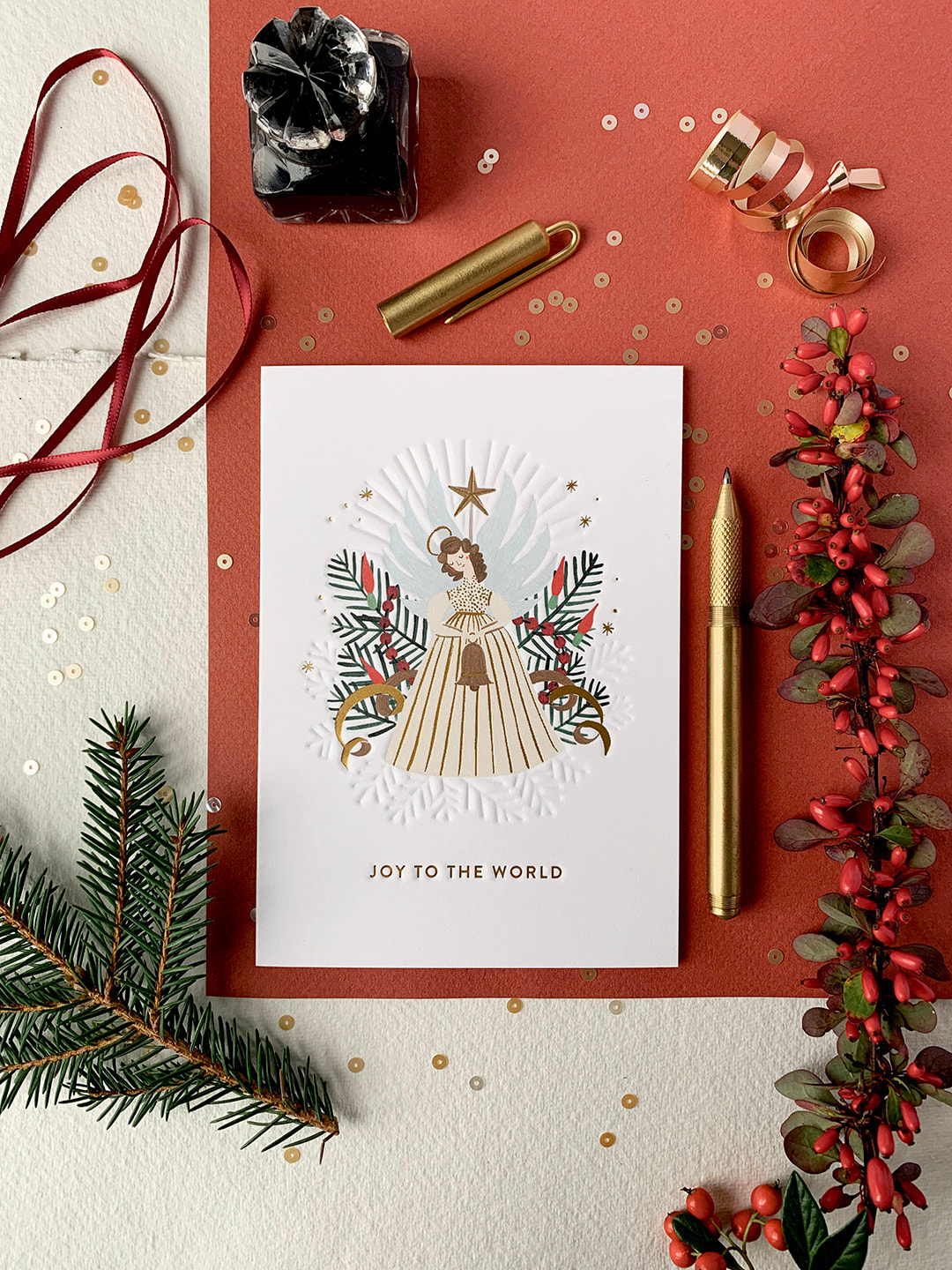 Hello friends! I'm so excited to share some new holiday cards I designed for Lagom Design that are now available over on their website. The more cards I design the more I fall in love with it. A well made card is like holding a tiny treasure. It's a keepsake and these ones are particularly close to my heart. I love Christmas! They are beautifully printed on quality card stock with blind embossing and gold foil detail to make them extra special. I hope you and yours enjoy them as much as I do!
 You can also check out my designer interview, The Magic of Small Things here on the Lagom blog.
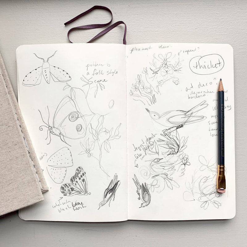
All the best, Meghann 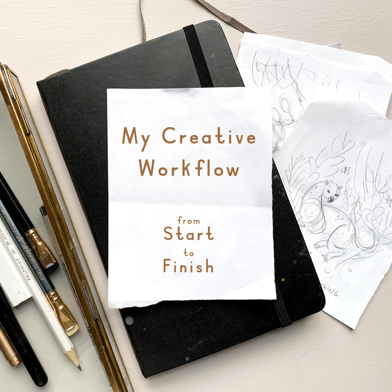 Hello friends! I’m so excited to share with you a sneak peak into my creative workflow. I’ll be sharing everything from how I come up with ideas to planning, sketching and creating a finished piece. Starting is the hardest part for me, but when I break my process down into steps it really helps to remove the overwhelm, and lets me get to the fun part, painting! Firstly, I should say that this is the method that I’ve found works best for me. There are infinite ways to create artwork and this is only one. I work mainly with traditional media in an illustrative style so that’s what this process is geared towards. If you prefer to paint intuitively or work purely digitally then some of these methods might not be a perfect fit but you can always adjust them to suit your unique process. Take what works for you and leave the rest! So with that said let’s get to the nerdy good stuff… 1. RESEARCHResearch involves, gathering ideas and inspiration. Taking inspiration from your daily life is an easy place to start. You never know when a great idea will pop into your head so be ready to write it down so you can reference it later. A little notebook works great for this but my favourite tool is the Notes app on my phone. I keep a running list of anything and everything. These don’t have to be flushed out ideas, just a word or two, and not everything will pan out but you might be surprised by what does make it into a finished piece!
Creating a mood board of colour and reference images can also help you create a beautiful finished product. You can create a physical inspiration board with magazine clippings, colour chips and and other objects or you can create a virtual board using Pinterest. Reference things like home decor, photography, vintage patterns or anything else that you find interesting, but try not to include artwork in a similar vein as your own. You want to come up with your own, original work and not be overly inspired by someone else's. 2. PLAN Planning ahead will help remove the overwhelm when starting a new piece of art. Once I’ve done my research and I know what my subject matter is, I like to spend a little bit of time experimenting in my sketchbook to get warmed up. You can play with sketching or painting some individual elements or jot down a few quick layout ideas that you have floating around in your head. Look for interesting shapes and details that you might want to feature or embellish later. Don’t think too hard just play and discover. No one is going to see this so just try anything and everything you can think of.
Next I usually move on to figuring out a basic layout by drawing some simple thumbnail sketches. I find it easier to do this ahead of time partially out of personal preference but also because, depending on what I’m working on I may have to send sketches to a client for approval before moving forward. They don’t have to be complicated, these are just rough layout suggestions to act as a guide or jumping off point. These are meant to be quick and rough so take the preciousness out of it by giving yourself a time limit of 4 thumbnails in 20 minutes. Make it 10 minutes if you’re up for a challenge! If you’re comfortable painting loosely, without a lot of structure then you can choose your favourite thumbnail and move on to paint from here but if you’re like me you might want to refine your chosen thumbnails into a slightly more flushed out sketch. Either method is just fine so do what feels best for you.
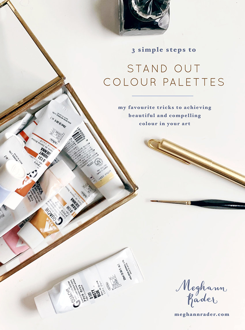
You can also plan out your colours in advance which is what I do. Check out my Free Guide to Creating Stand Out Colour Palettes, to learn all about how I choose my colours.
Now for the really fun part… 3. PAINTOf course you can tackle this step any way you’d like and if you have a way that works for you then go for it! There is no right or wrong way to create your final image, be it paint, collage, digital, etc., but here’s what I do because it works for me… I like to build up my artwork in layers. This allows me to see and adjust the entire piece as I go and that helps with getting a well balanced look to the final artwork. I start by either lightly sketching or using a light table and then blocking in the basic shapes of my composition first. The idea is not to focus on just one area at a time and make it perfect, but to instead focus on the overall shapes you are creating and build up the detail evenly around the piece. Think of it in terms of writing an essay, you need to create your outline first and then refine and refine from there in order to end up with a cohesive finished product. Side note - If I’m creating something that I know is going to end up as a digital file for licensing then I will usually break my composition up into icons so that it’s easier to edit and assemble on the computer, however I’ll still use this method of working in layers within each icon. Again, not necessary, just what works for me.
Finally, take your time. Give yourself a break. If you find yourself struggling, sometimes the best thing you can do is walk away and come back with fresh eyes, and if after that you still feel the need to stop and and start again, that’s okay too. What might look effortless on Pinterest or Instagram probably had a lot of hard work and a good dose of frustration put into it. It’s totally normal and all part of the process.
Thank you so much for following along! I hope that you’re able to implement some of these strategies into your own workflow and I’d love to see what you create! Feel free to leave a comment below, tag me on Instagram or send me a message letting me know what you want to learn about next!
Want to stay up to date on upcoming posts? Sign up for my newsletter here! You can also check out my full range of greeting cards with Lagom Design here. Best, Meghann Find me on Instagram: @meghannrader |