|
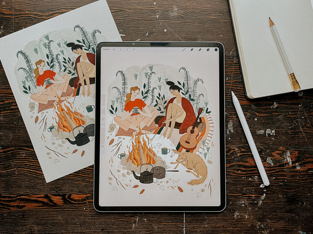
Hello friends! I thought it would be fun to share a little bit about my journey with Procreate today. Why I use it, how it fits into my workflow, what I like and don't like about it, as well as some workarounds that I’ve found helpful. There are a lot of options out there when it comes to creating artwork for illustration/licensing and it’s easy to get caught up in the FOMO of what everyone else is doing, so I wanted to share this caveat first... Procreate is just one of many great tools out there. From traditional media to digital, raster to vector, there is a place for all of it. While learning how other artists work can be fun and inspiring, remember that the best way to create artwork is not what I or anyone else may suggest. It's whichever way works for you and expresses your artistic vision the most accurately. And while we're here, I feel obliged to say that this post does not contain affiliate links. I'm just sharing for the fun of it! That being said, let's talk Procreate! Why I started working in Procreate My working style has gone through a lot of iterations over the years. Like most creatives, I love playing with new tools and collecting all the cool art supplies! But that can also get overwhelming. I’m easily bogged down by too many choices and visual clutter. I've learned that I personally do better with fewer choices, and that my work will be better if I can focus on improving at one or two techniques at a time rather than being mediocre at everything. I used to hand paint all of my work, scan it and edit it in Photoshop. I use Photoshop because it’s what I learned in art school and so I was already somewhat familiar with it, although, to be honest, most of the PS tools that I actually use I learned through Google search. I did learn Adobe Illustrator, but while I love what other artists are able to create with it, it never felt quite right to me in terms of my own artwork. I started getting more work as an illustrator just after my daughter was born but it became very difficult to work at all at that point. She was not a good sleeper and so working during nap time was a bit of a joke. Around this time Procreate started to become popular and I thought it could be a good option for me. It gave me a lot of freedom to work while also being at home with my young children. I didn’t have to worry about finding time to paint, scan and edit my work, clean up my supplies, or keep my paint covered brushes away from grabby hands. So I decided to go for it. How I use Procreate It took me quite a long time from the point of first using Procreate to where I became comfortable enough to use it as my main tool. Over two years! At first I just used it to create my rough sketches and then I would hand paint my final artwork. But, as I said, it became more and more difficult to keep up, especially when I eventually had two non-napping kids at home with me all day. I’ve also come to the conclusion that I’m just a naturally slow person and it takes me twice as long to do anything. Eventually, I decided that the only way I was going to be able to create art at a steady pace was if I was working mostly on the Ipad. Getting used to working more fully in Procreate was, as with most things, a matter of practicing and creating lots of work. I spent a lot of time experimenting with different brushes until I found a few that worked best for me. These ones are my current favourite: bardotbrush.com/product/artists-pastels/ As of this writing my process usually looks like this:
Dislikes While there are a lot of things that I love about Procreate, there are a few things that I don’t like. In particular, I’ve always struggled with image degradation and limited layers. I can tend to be on the stubborn side and these two things irritated me so much in the beginning that they are the main reason it took me so long to come around to using Procreate more fully. With practice and some research I was able to figure out some workarounds and I find now that a little bit of inconvenience is worth it when I consider all of the benefits it’s giving me. Image degradation This was one of the biggest issues that I had/have with Procreate and I feel like it doesn’t really get talked about much, maybe I’m wrong on that? Every time something gets moved around or adjusted in Procreate the image quality of that object will degrade slightly. So, for example, if you’ve drawn final artwork for a pattern and are then attempting to build that pattern within Procreate, moving each motif around and fiddling to get them in just the right place, you’re going to end up with blurry artwork after a few moves. It’s pretty annoying. To work around this I always create a fairly accurate rough sketch first, even if I’m creating a pattern, I’ll create the repeat in sketch form first and get everything where I want it to be before creating the final artwork. When I’m creating the final artwork I try not to move anything. If something does need adjusting, I'll do that at the end once I’ve exported everything into Photoshop. Then I can freely move things around without any issues. If I really need to move something in the moment then I’ll create a duplicate and move that into the correct place and then replace it with the original in Photoshop later. Side note: Creating a rough sketch first is something you’ll need to be doing anyways if you’re going to be creating commissioned work for clients so it’s a good habit to get into.
Limited layers If you work in rasters then you know it’s important to work as large as possible. I like to create most of my work at 600 dpi, just to be safe (I’ve never had an issue with needing anything larger). But an 8x10 canvas in Procreate only has so many layers, and being used to working in Photoshop I liked to have every single thing on its own layer. It's a bit clunky, but to work around this, once I reach my layer limit, I duplicate my file and merge all of the layers in the duplicate file together. Then I'll continue to work on new layers in the duplicate file. If I'm working on something very complex I might do this a few times. Once I'm done, I'll combine all of the layers from the original Procreate file and each duplicate file into one file in Photoshop and remove the merged layers (in PS select all layers and then drag and drop them into the new file). It sounds more complicated than it actually is! I’ll also sometimes combine layers that have items that don’t touch each other and separate them later in Photoshop, but that can be a bit tedious. Lately, I’m trying not to be as picky about having everything on a separate layer because I’ve rarely had to go back and make adjustments. If I feel it’s safe to combine layers then I will, knowing that I can always pull off some Photoshop magic to make adjustments if I really need to. Likes Time saving Working in Procreate saves me a lot of time because I’m able to be portable and work almost anywhere as opposed to being stuck at my desk painting, scanning and editing my artwork. Not only does this free up my time, It also means that I'm spending less time on each particular piece while still earning the same amount of money from it, so I end up earning more per hour worked. Freedom to mess up Along with the freedom of portability that I just mentioned, I also feel more free in my drawing itself. When hand painting I was often afraid of making mistakes and ruining hours of work. With Procreate I have been able to loosen up and try new things without that worry. It’s allowed me to grow my skills and my confidence. Like/Dislike Cost While an iPad is a big investment, the actual Procreate app is a very small one time fee of around $20 depending on where you live, which is incredible considering the value it provides and in comparison to other programs such as the Adobe suite. I’m also saving a ton of money that I’d normally be spending on art supplies. That one is both a pro and a con! I use my iPad for so much more than just drawing and so it has been worth it for me. I get asked this a lot so I’ll share here, if you’re considering purchasing an iPad I would prioritize screen size over storage. I export all of my work and save it in Dropbox so I don’t need a lot of storage space. The iPad that I’m using right now is a 12.9” iPad Pro. What about you? Do you have any pros and cons or general Procreate tips that you’d add to this list? Let me know in the comments below!
17 Comments
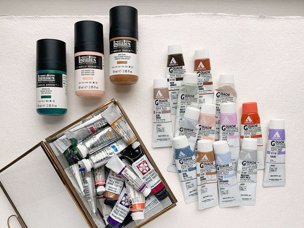
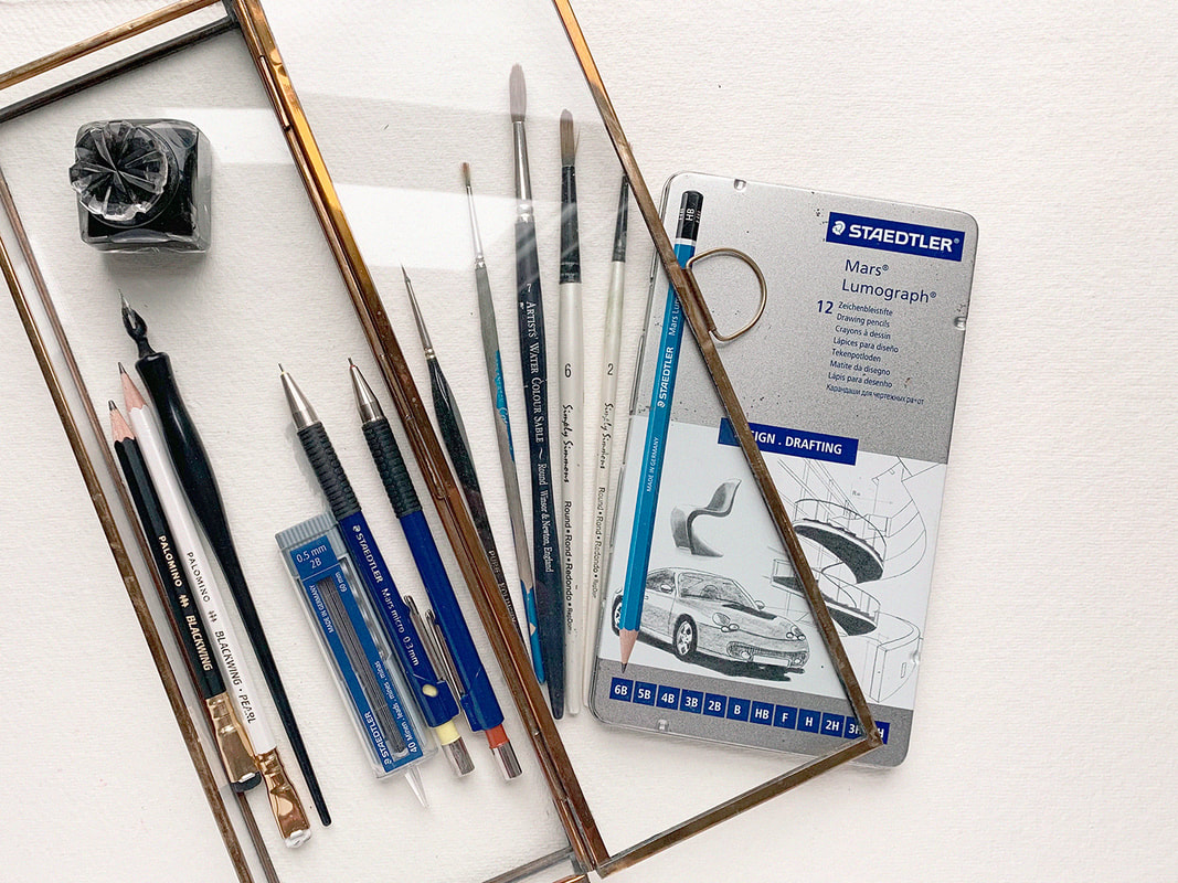
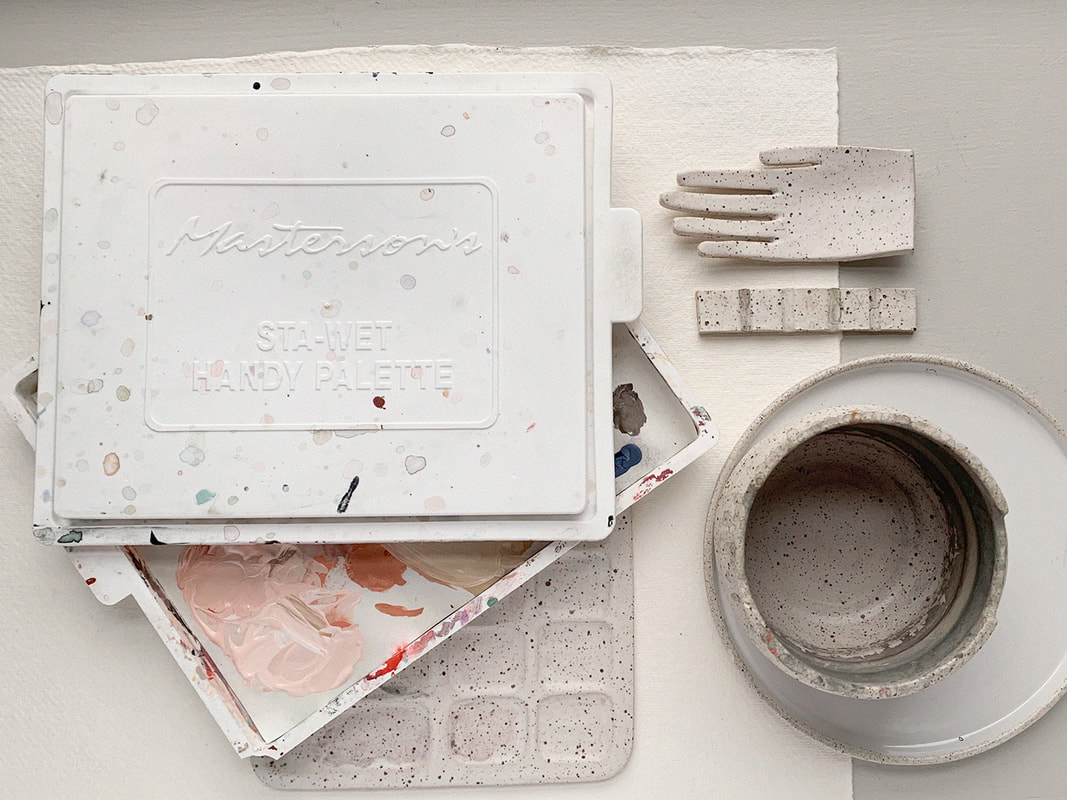
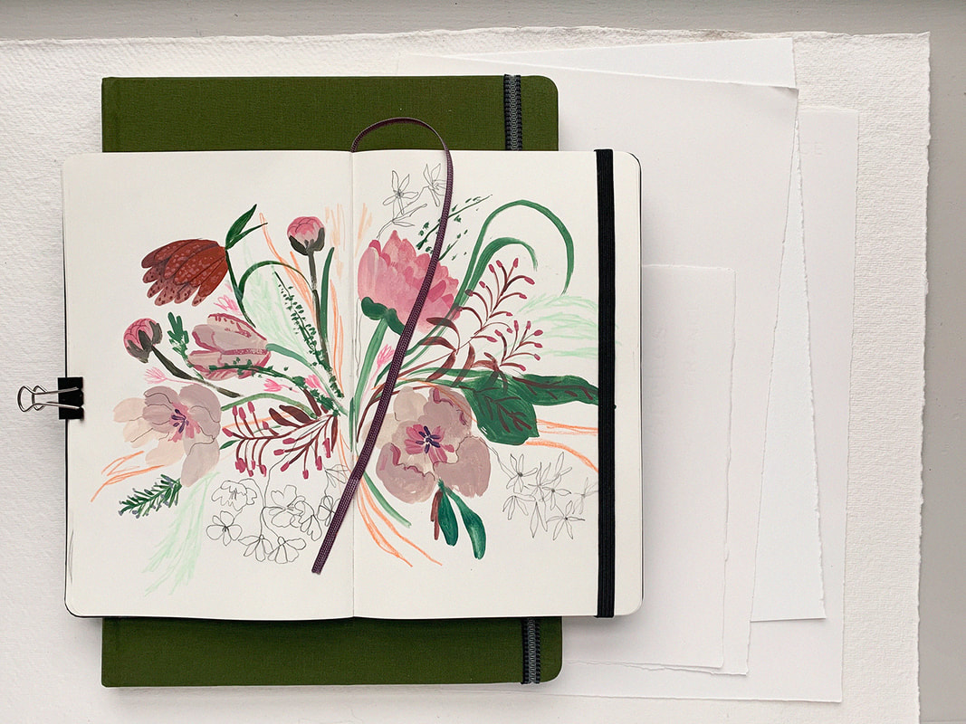
Some of you might know that after finishing art school I worked at a local art supply store for several years. While there I learned A LOT about all of the various supplies out there. I still love talking about art supplies and will take every opportunity to do so. So in my attempt at a holiday gift guide of sorts I’ve compiled this list of supplies that I love and use most often. It's certainly not a comprehensive list (although I did get a bit carried away with the descriptions!) but hope you enjoy reading through and maybe you'll find something fun for your wishlist! Keep in mind that these are the tools that I’ve found work best for me. There are countless other tools out there that are just as wonderful and if you have anything you’d like to add to this list please share in the comments! I’m linking to my favourite local art store where possible and I would encourage you to shop small and look for these products at your own favourite locally owned business. GouacheGouache is basically an opaque watercolour paint. I love working with it because it has a beautiful silky matte finish and it’s much more forgiving and easier to control than regular watercolour. Traditional gouache is water-soluble and you can re-wet it after it dries. So if you’re used to using watercolour and want to give gouache a try, a traditional water soluble gouache like Winsor & Newton would be a great way to dip your toe (or brush!) in. You can also use traditional gouache in combination with your existing watercolour paints which is handy, especially if you just want to start by incorporating a few colours here and there. When I first started using gouache I was more comfortable with acrylic paint which remains solid once dry, allowing for layering without affecting the paint underneath, so I opted for acrylic gouache which has those same features. If you go this route, I’d recommend getting a Stay-Wet Palette as well. They’ll help prevent your paint from drying out in-between uses. I'll talk more about them below. Whichever your preference, I definitely recommending giving gouache a try. It may take a bit but once you get the hang of it I know you will love it! For those who've been wondering how to pronounce this funny looking word, I've heard it said a few different ways, but the way I learned and have always known it to be is "Gwash", as in the word "wash" with a G sound in front. Acryla Gouache Liquitex Acrylic Gouache Winsor & Newton Designers Gouache (Water soluble) WatercolourI don’t use a ton of watercolour but I do have a few go-to favourites which I’ll share here. As with most paint, watercolour is available in both student and artist quality. The difference being the amount of extra “filler” to pigment ratio. The pigment being the expensive part . Student quality paint has a much higher amount of filler which makes it less expensive. It also means that the colours are less vibrant both on their own and even more so when mixed, so the end result is often not great. Many beginners give up after their first few attempts, mistakenly thinking that they just aren’t good at painting, when in fact it’s the low quality paint that is making things difficult. So, If you can, I would always recommend investing in artist quality paint when possible. If you want to save some money with student quality paints there are a few things you can do. Winsor & Newton’s Cotman watercolours are a higher end student quality paint that is a great option. You can also mix things up by purchasing your whites, browns and other neutrals in student quality and splurge when you can on the more expensive bright colours which have a much higher pigment load and will go a lot further in use as well as more vibrant mixing. Winsor & Newton Watercolour (Artist Quality) Daniel Smith (Artist Quality) - Offers a huge variety of really interesting colours unique to this brand. Holbein Watercolour (Artist Quality) Cotman Watercolour (Student Quality) Brushes While I’m pretty particular about paint, I’m not nearly as particular about brushes. Even old splayed brushes have their uses in creating beautiful texture. For Gouache I prefer using inexpensive mixed media brushes like Robert Simmons or synthetic watercolour brushes like W&N Cotman brushes because I find the gouache tends to be a bit harder on the brush and the sturdy synthetic fibre holds up better, I also don’t feel as bad about replacing them more often. For watercolour I’d recommend using a natural bristle brush because all of the little micro imperfections in the fibre allow the brush to hold much more water and release it slowly over time, meaning you’ll have better control without the constant re-dipping. The natural curve of the fibre also makes a point that’s perfect for fine details, even with a large brush. Cotman Watercolour Brushes (Gouache or Watercolour) Simply Simmons Mixed Media Brushes (Gouache) H.J 170 Kolinsky Sable Brushes (Gouache or Watercolour) - Fine detailing W&N Professional Watercolour Sable Brushes (Artist Quality, Watercolour) Winsor & Newton Series 7 Kolinsky Sable Watercolour Brushes (Artist Quality, Watercolour) - A major splurge but these brushes have been known to last a lifetime and beyond. They are the best of the best. Sketching While the hot commodity in pencils these days is Blackwing, I’m not totally sold. They look great, but in my humble opinion they are basically just a regular 6B pencil in a nice outfit. I prefer my old Staedtler Pencils for sketching. That being said, I do like to throw a Blackwing into my photo’s every now and then for the pretty factor. I hope you have yourself a little laugh whenever you spot one in my photos from now on! Staedtler Mars Lumograph pencils Staedtler Mars Micro Mechanical pencils Blackwing pencils I also love using a dip pen for hand lettering. I have this set from Speedball Speedball Sketching Project Set Palettes and Accessories Remember a bit ago when I said I love Acrylic gouache? The biggest complaint I hear from people against using it is that it dries too fast and therefore is a waste of paint. To that I say…Nonsense! You need a Stay-Wet Palette. I was first introduced to Say-Wet palettes when I used to take art lessons after school as a child. They would keep my precious acrylic paints dry all week long until my next lesson and I’ve been using them ever since. If you’re looking for something a little prettier, and dare I say Instagram worthy, then a beautiful ceramic plate is always great or if you want to splurge, Sugarhouse Ceramic Co. makes some very beautiful ceramic palettes and other studio supplies like painter’s pots and brush rests. Masterson’s Sta-Wet Palette Sugarhouse Ceramics Co Paper and Sketchbooks When choosing a paper for illustration I’m always thinking about what is going to scan well. I look for smooth bright white paper that is thick enough to hold up to wet media and isn’t too absorbent, which causes the paint to bleed into the fibres rather than sit nicely on top of the paper. Arches Hot press is beautiful to work with but I also really like using Strathmore Mixed media pads or Canson XL Watercolour Pads because they’re a bit more economical for the way that I work. For sketchbooks I love using Moleskin as well as Global Art Hand Book Artist Journals which are very similar but have thicker paper and are slightly less expensive than Moleskin.
Arches Hot Pressed Watercolour Paper Strathmore 300 Series Mixed Media Pad Canson XL watercolour pad Moleskine Notebook Global Art Hand Book Artist Journals You made it to the end! Thank you for hanging in there. That is my list so far but it's just the tip of the Iceberg! In future posts I’ll be sharing more of my artsy favourites like all of my favourite digital supplies, books and online courses. Stay tuned! And be sure to comment below with you’re favourite supplies! Best, Meghann |

