 Hello friends! I thought it would be fun to talk a little bit about art licensing today, more specifically, working on commissioned projects! 🤓 If that sounds like your kind of jam, then read on... The Basics Briefly put, art licensing is when you "rent" out your artwork to a company, for an agreed upon fee and period of time, so that they can use that artwork on their products. Licensed art can be found on pretty much anything. Think wrapping paper, clothing, housewares, etc. When I first started licensing my artwork, I had a vision of myself creating my own collections and working on personal projects all day long, creating a big online portfolio and licensing that pre-made artwork to clients over and over again... Show me the $$$! While that happens to some extent (minus a few dollar signs), the majority of my licensing income has actually come from commissioned projects. What that means is that a prospective client has their own vision for a project, sees my portfolio, thinks that my style would work well with their idea and asks me to create new artwork specifically for that project. Contracts Even though this new art has been commissioned, it doesn't mean that you have to give away all of your rights. Commissioned art can also be licensed, just like licensing pre-existing artwork. It all depends on what’s negotiated in the contract. The three big T's to consider when negotiating any licensing contract are: The type of product(s) that the license applies to (sometimes referred to as the industry, market or category). The term (length of the license). And the territory (where in the world does the contract apply? Just one country? Worldwide?). All of these details, along with the size of the company and the amount of product being sold, will help to determine the overall fee, and, of course, the more rights you give away, the higher the fee! I don't like dealing with fees and negotiations, which is one of the reasons that I prefer to work with an agent who does all of that for me (a post for another time!). But if you’re someone who is comfortable with that sort of thing then you can absolutely do it yourself. There is a ton of information out there about pricing your artwork. A great place to start is a book called the Graphic Artists Guild Handbook: Pricing & Ethical Guidelines. All of this can get a bit confusing when you’re first starting out but just know that the more projects you work on the easier it is to understand the process and you will learn to make more informed decisions over time. Now let’s go through the process of how I work on a typical commission and see what it looks like… The Brief When I take on a new commission it often comes with a brief. A brief is how the client communicates what they want from you. It can range from very informal (you might just be given a general theme and not much direction) to a more formal written brief with varying amounts of information. Often a written brief will include the file specifications, any specifics about words or particular imagery required, past work of yours that the client wants you to reference for style, colour etc. and more. I've had briefs that range anywhere from 1 page to over 25 pages. They're also, generally, confidential and so I can't share any with you here unfortunately, but just know that every company is different and they all have their own ways of working so no two briefs are alike! Roughs When working on a commission, you'll usually be expected to go back and forth with the client a few times in order to get things just right. These back and forth adjustments are called revisions and there will often be a few rounds of revisions within each project. Most often I am asked to create a rough sketch, then the client will come back with revisions and once those are approved, I'll do a colour rough. Some artists don't create a colour rough, unless specifically asked to, because it doesn't work as well for their style or process but it's something that I find helpful to work out beforehand so I prefer to do so.
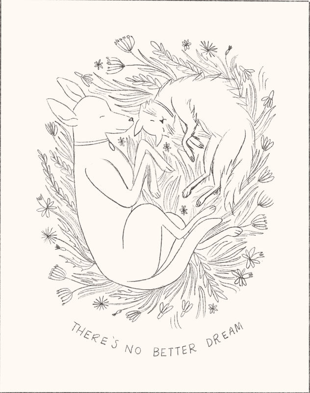
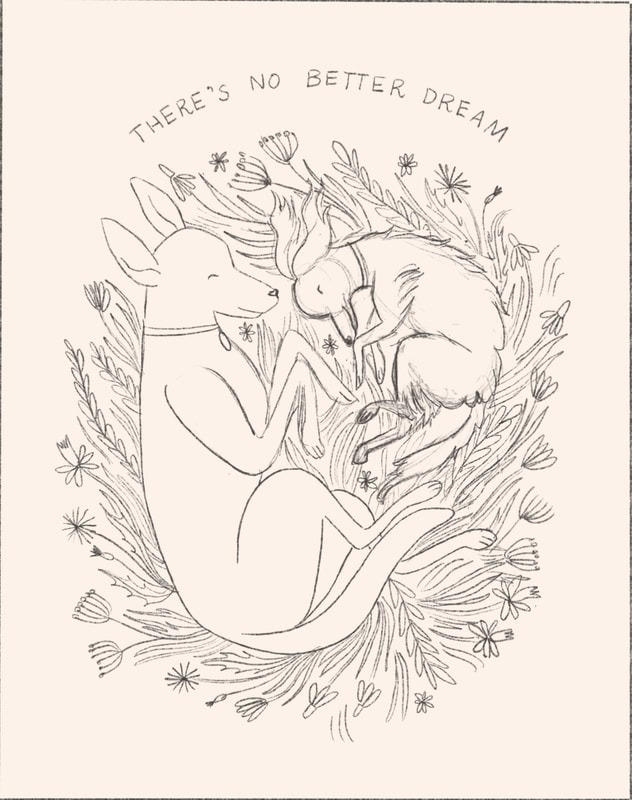
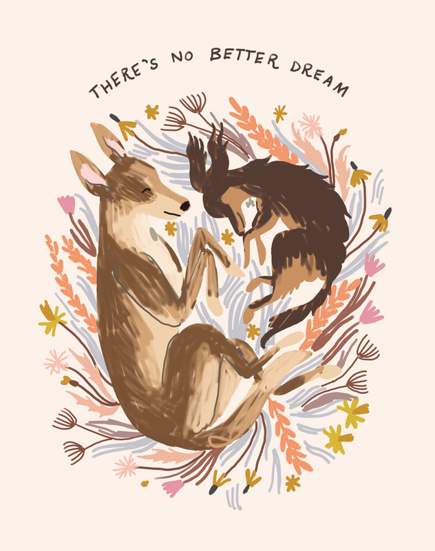
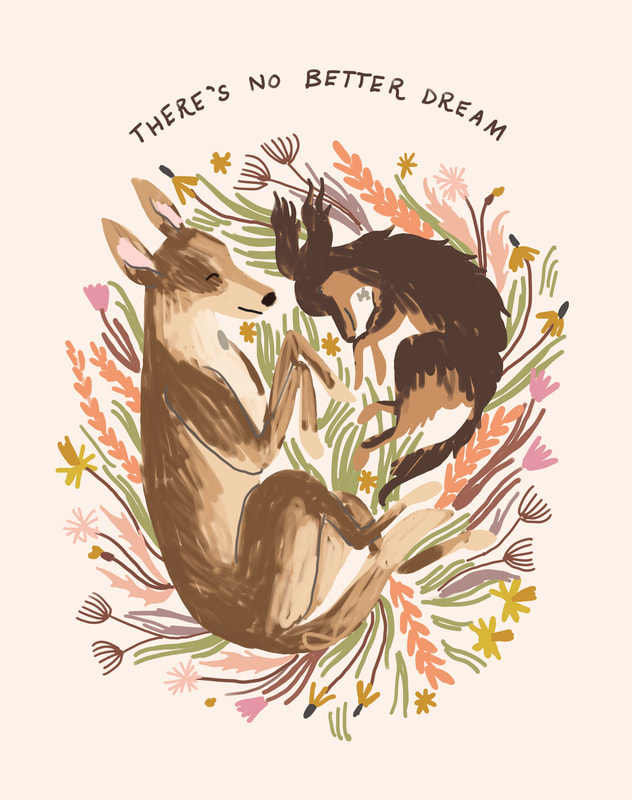
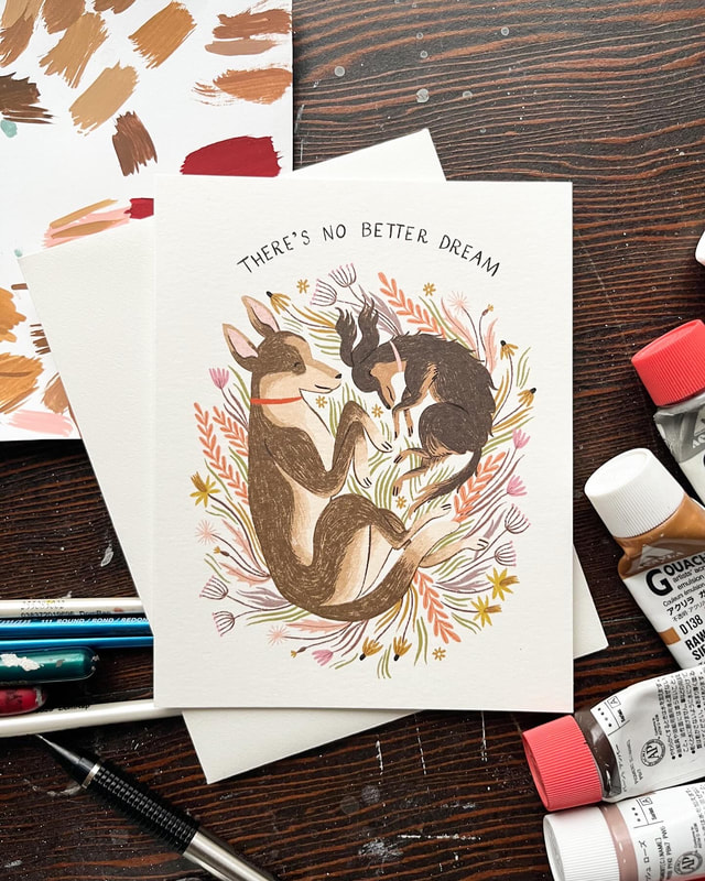
The rough sketches above were created as part of a commission from greeting card company Compendium, for their Love Muchly range. In the brief I was given the card occasion (love) and the front and interior text. They gave me some general guidance on potential themes, one of which was animals. My initial rough sketch included a cat and a dog cuddling and the suggested revision was to change it to two dogs cuddling as the initial design was leaning too close to the friendship category. I was able to make the change fairly easily by adding a dog of similar size and scruffiness to the cat.
After submitting my initial colour rough there was just one minor request to change the colour of the grass from blue to green. From here the colour rough was approved and I was able to move on to creating the final artwork! It can be hard to hear someone critic your creative work, especially if you're not used to it, but it is a very normal and common part of the process, so try not to take it personally. It helps to remember that this isn’t a solo project, you are working collaboratively. Your job is to help someone else bring their vision to life and their feedback is meant to clarify that vision, not to bring you down. In my experience, the end product is usually better for it. Tip: If you're negotiating your own contract and you're feeling uneasy about revisions, it might be worth negotiating the number of rounds of revisions you will include in the agreed upon fee into the contract. The majority of clients are pretty reasonable but sometimes people can get a little bit carried away with changes, especially if they don't have a clear vision of what they want beforehand. Final Art Ideally, all of the kinks will be worked out of the project during the rough revisions and the final artwork won't need any changes, but sometimes there might be a couple of small tweeks at this stage as well. Because my final artwork is usually in a layered Photoshop file, it is too big to send to the client via email. I use Dropbox to store all of my files and so it’s easy to create a sharable link for the client to access the final file(s) there. You can also use a file sharing website like WeTransfer to send larger files. At this point, if all goes well, the client will love your work and one day in the future you’ll receive a nice big box of samples in the mail and finally see all of your hard work come to fruition!
If you are just starting out with illustration or surface design and are finding it difficult to start licensing your work, commissioned projects can be a great way to open you up to more opportunities. It will also give you more experience working collaboratively with art directors and give you a direct sense of what they're looking for and how they think about the artwork. Thank you so much for reading! If you haven’t already, you can subscribe to my newsletter and get notified whenever I have a new post on Ye Old Blog. You’ll also get my Free Guide: How to Draw Hands in the process! - Meghann
10 Comments
Hello friends! I thought it would be fun to share a little bit about my journey with Procreate today. Why I use it, how it fits into my workflow, what I like and don't like about it, as well as some workarounds that I’ve found helpful. There are a lot of options out there when it comes to creating artwork for illustration/licensing and it’s easy to get caught up in the FOMO of what everyone else is doing, so I wanted to share this caveat first... Procreate is just one of many great tools out there. From traditional media to digital, raster to vector, there is a place for all of it. While learning how other artists work can be fun and inspiring, remember that the best way to create artwork is not what I or anyone else may suggest. It's whichever way works for you and expresses your artistic vision the most accurately. And while we're here, I feel obliged to say that this post does not contain affiliate links. I'm just sharing for the fun of it! That being said, let's talk Procreate! 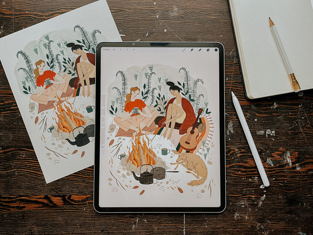 Why I started working in Procreate My working style has gone through a lot of iterations over the years. Like most creatives, I love playing with new tools and collecting all the cool art supplies! But that can also get overwhelming. I’m easily bogged down by too many choices and visual clutter. I've learned that I personally do better with fewer choices, and that my work will be better if I can focus on improving at one or two techniques at a time rather than being mediocre at everything. I used to hand paint all of my work, scan it and edit it in Photoshop. I use Photoshop because it’s what I learned in art school and so I was already somewhat familiar with it, although, to be honest, most of the PS tools that I actually use I learned through Google search. I did learn Adobe Illustrator, but while I love what other artists are able to create with it, it never felt quite right to me in terms of my own artwork. I started getting more work as an illustrator just after my daughter was born but it became very difficult to work at all at that point. She was not a good sleeper and so working during nap time was a bit of a joke. Around this time Procreate started to become popular and I thought it could be a good option for me. It gave me a lot of freedom to work while also being at home with my young children. I didn’t have to worry about finding time to paint, scan and edit my work, clean up my supplies, or keep my paint covered brushes away from grabby hands. So I decided to go for it. How I use Procreate It took me quite a long time from the point of first using Procreate to where I became comfortable enough to use it as my main tool. Over two years! At first I just used it to create my rough sketches and then I would hand paint my final artwork. But, as I said, it became more and more difficult to keep up, especially when I eventually had two non-napping kids at home with me all day. I’ve also come to the conclusion that I’m just a naturally slow person and it takes me twice as long to do anything. Eventually, I decided that the only way I was going to be able to create art at a steady pace was if I was working mostly on the Ipad. Getting used to working more fully in Procreate was, as with most things, a matter of practicing and creating lots of work. I spent a lot of time experimenting with different brushes until I found a few that worked best for me. These ones are my current favourite: bardotbrush.com/product/artists-pastels/ As of this writing my process usually looks like this:
Dislikes While there are a lot of things that I love about Procreate, there are a few things that I don’t like. In particular, I’ve always struggled with image degradation and limited layers. I can tend to be on the stubborn side and these two things irritated me so much in the beginning that they are the main reason it took me so long to come around to using Procreate more fully. With practice and some research I was able to figure out some workarounds and I find now that a little bit of inconvenience is worth it when I consider all of the benefits it’s giving me. Image degradation This was one of the biggest issues that I had/have with Procreate and I feel like it doesn’t really get talked about much, maybe I’m wrong on that? Every time something gets moved around or adjusted in Procreate the image quality of that object will degrade slightly. So, for example, if you’ve drawn final artwork for a pattern and are then attempting to build that pattern within Procreate, moving each motif around and fiddling to get them in just the right place, you’re going to end up with blurry artwork after a few moves. It’s pretty annoying. To work around this I always create a fairly accurate rough sketch first, even if I’m creating a pattern, I’ll create the repeat in sketch form first and get everything where I want it to be before creating the final artwork. When I’m creating the final artwork I try not to move anything. If something does need adjusting, I'll do that at the end once I’ve exported everything into Photoshop. Then I can freely move things around without any issues. If I really need to move something in the moment then I’ll create a duplicate and move that into the correct place and then replace it with the original in Photoshop later. Side note: Creating a rough sketch first is something you’ll need to be doing anyways if you’re going to be creating commissioned work for clients so it’s a good habit to get into.
Limited layers If you work in rasters then you know it’s important to work as large as possible. I like to create most of my work at 600 dpi, just to be safe (I’ve never had an issue with needing anything larger). But an 8x10 canvas in Procreate only has so many layers, and being used to working in Photoshop I liked to have every single thing on its own layer. It's a bit clunky, but to work around this, once I reach my layer limit, I duplicate my file and merge all of the layers in the duplicate file together. Then I'll continue to work on new layers in the duplicate file. If I'm working on something very complex I might do this a few times. Once I'm done, I'll combine all of the layers from the original Procreate file and each duplicate file into one file in Photoshop and remove the merged layers (in PS select all layers and then drag and drop them into the new file). It sounds more complicated than it actually is! I’ll also sometimes combine layers that have items that don’t touch each other and separate them later in Photoshop, but that can be a bit tedious. Lately, I’m trying not to be as picky about having everything on a separate layer because I’ve rarely had to go back and make adjustments. If I feel it’s safe to combine layers then I will, knowing that I can always pull off some Photoshop magic to make adjustments if I really need to. Likes Time saving Working in Procreate saves me a lot of time because I’m able to be portable and work almost anywhere as opposed to being stuck at my desk painting, scanning and editing my artwork. Not only does this free up my time, It also means that I'm spending less time on each particular piece while still earning the same amount of money from it, so I end up earning more per hour worked. Freedom to mess up Along with the freedom of portability that I just mentioned, I also feel more free in my drawing itself. When hand painting I was often afraid of making mistakes and ruining hours of work. With Procreate I have been able to loosen up and try new things without that worry. It’s allowed me to grow my skills and my confidence. Like/Dislike Cost While an iPad is a big investment, the actual Procreate app is a very small one time fee of around $20 depending on where you live, which is incredible considering the value it provides and in comparison to other programs such as the Adobe suite. I’m also saving a ton of money that I’d normally be spending on art supplies. That one is both a pro and a con! I use my iPad for so much more than just drawing and so it has been worth it for me. I get asked this a lot so I’ll share here, if you’re considering purchasing an iPad I would prioritize screen size over storage. I export all of my work and save it in Dropbox so I don’t need a lot of storage space. The iPad that I’m using right now is a 12.9” iPad Pro. What about you? Do you have any pros and cons or general Procreate tips that you’d add to this list? Let me know in the comments below!
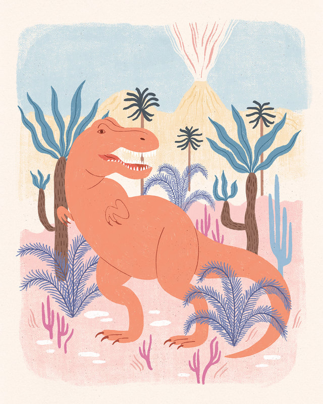
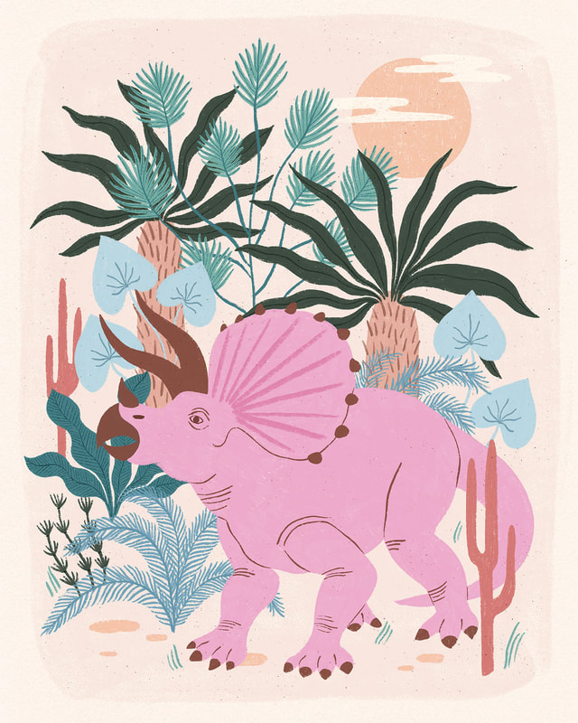
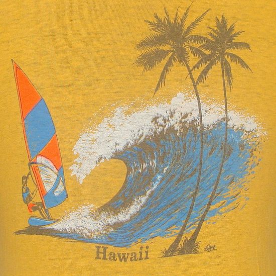
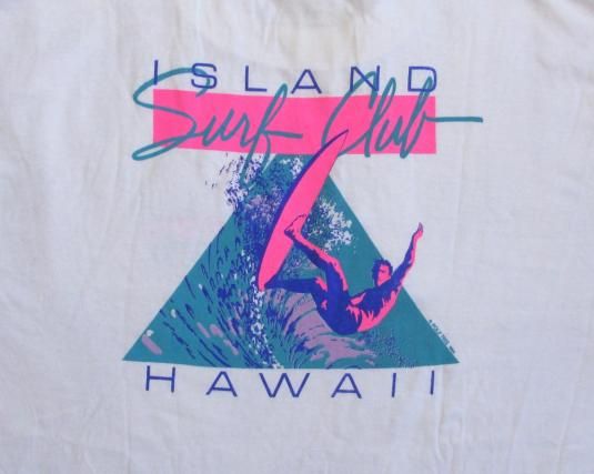
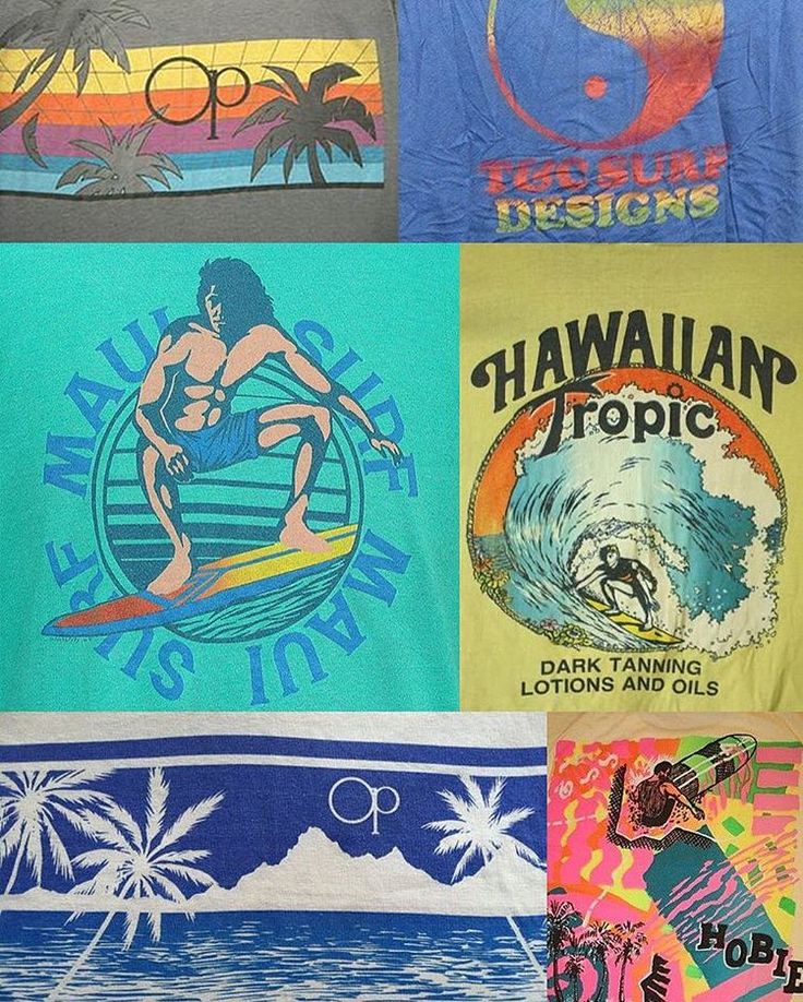
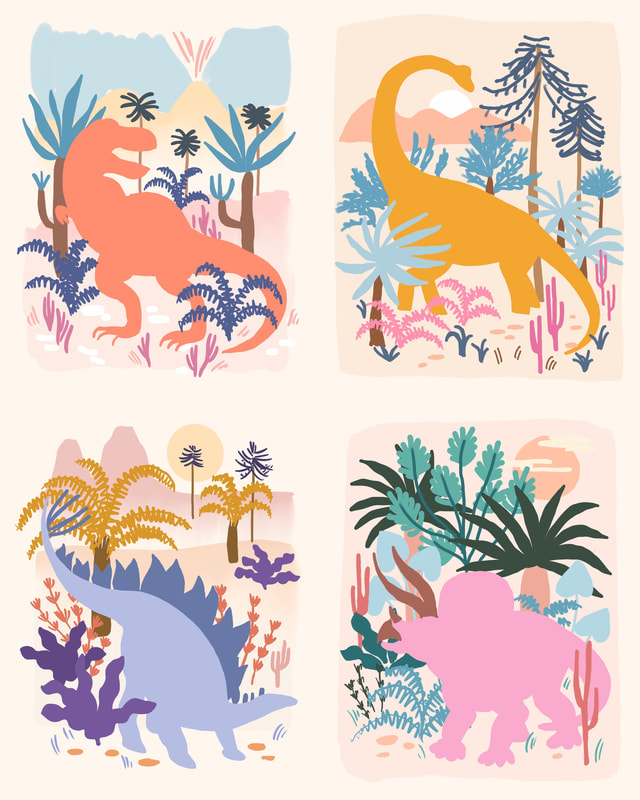
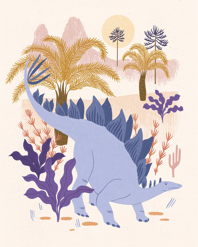
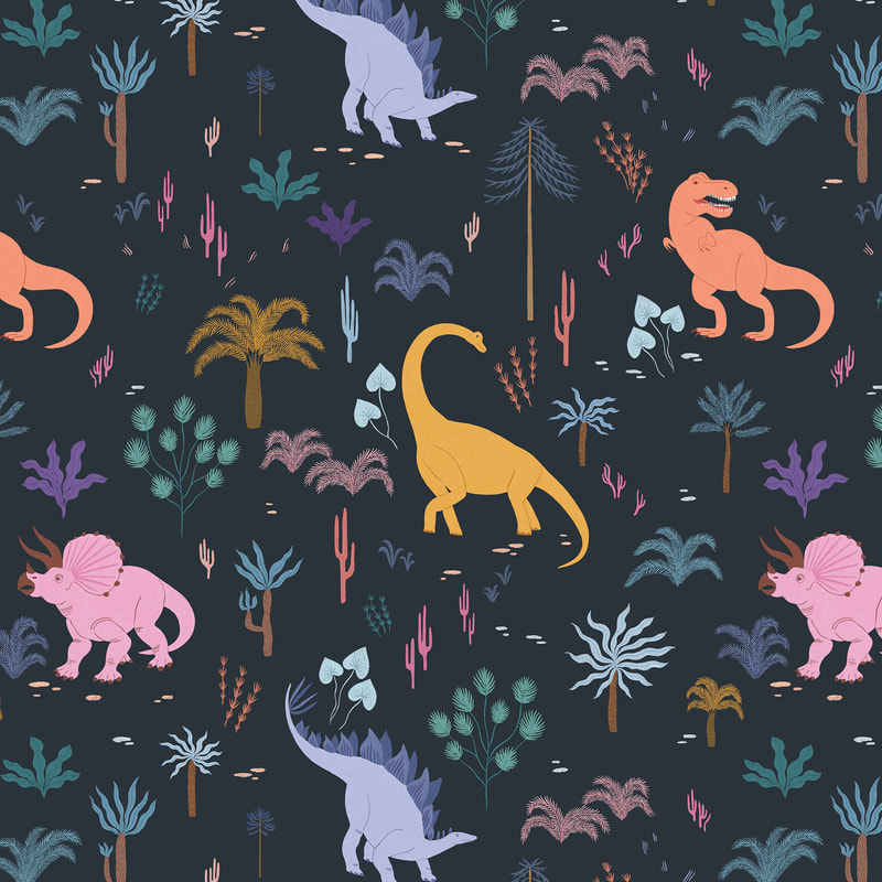
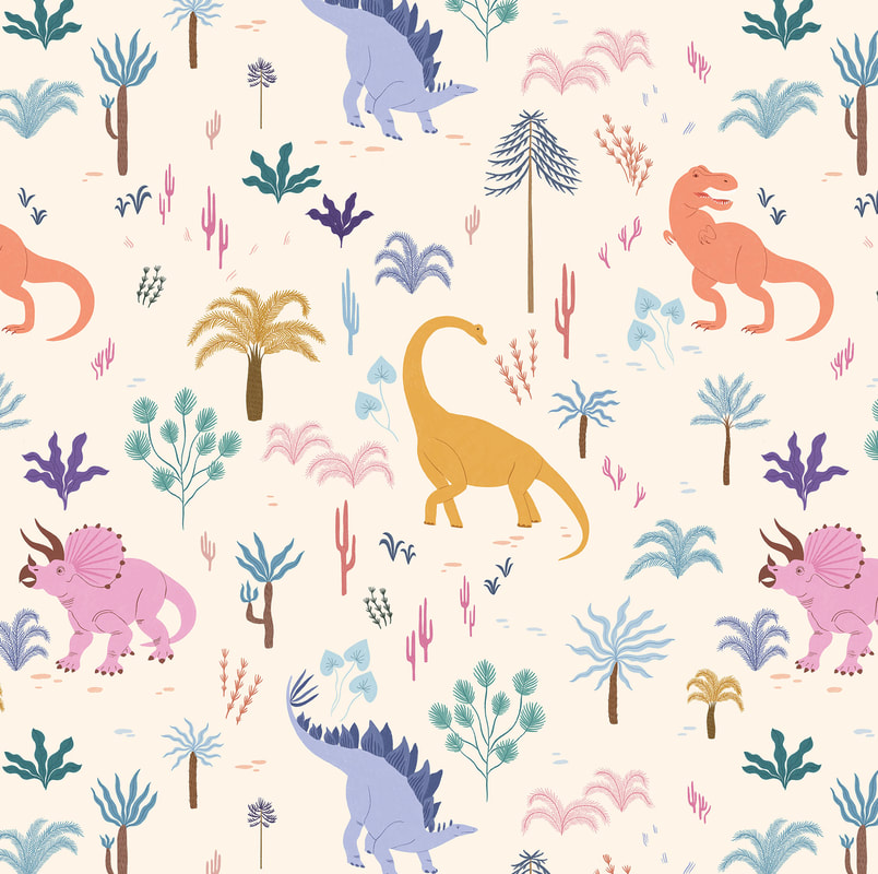
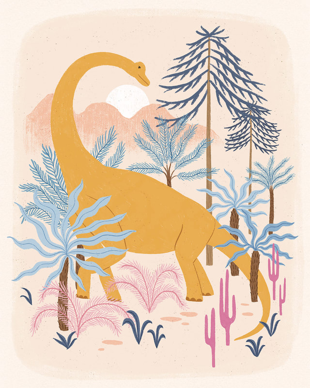
Hello friends! I’ve been busy the last few months working on a special project for my agent Jehane, Out of the Blue! Jehane gave all of her artists a series of creative briefs to work on throughout the year and now all of that work is being showcased in this fun event! For one of this year's themes, Life on Earth, I decided to step out of my comfort zone a bit and tackle a subject matter that I’ve never tried before, dinosaurs! I can’t tell you how much fun I had creating these dinosaurs. Maybe it was because the subject matter was so different and so I had no idea what to expect, but I really got into it! My inspiration for the look of this collection were the 80’s surf t-shirts of my childhood, Ocean Pacific anyone? I just couldn't stop thinking about how the slightly faded bright colours and scenic imagery would be a fun mashup with the dinosaur theme.
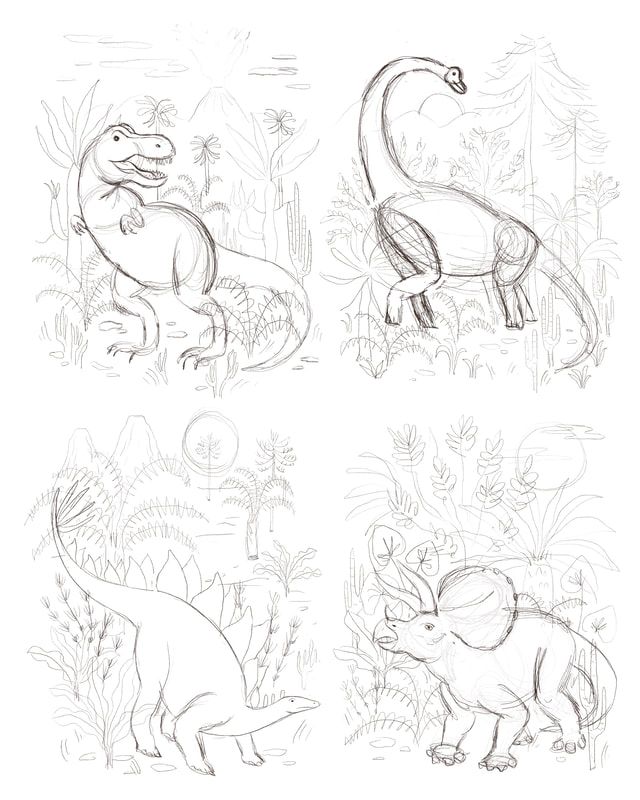
Seeing as I couldn’t go out and draw dinosaurs from life, I spent some time researching realistic looking dinosaurs and their skeletons to get a feel for what they looked like. Then I was able to draw my own versions after figuring out the general basic shapes that made up each dino. One of the most fun parts of this series was that I had no idea what my version of a dinosaur would look like. It was so interesting seeing them come together and I think they do look like they fit in with the rest of my work! I also spent some time researching plants and the type of landscape my dinos would have lived in. I even came across some prehistoric-like plants at our local Butterfly World which I was pretty excited about! It’s the little things, amiright? I live in a small town and going out to source real inspiration is a luxury. I usually end up doing most of my research online or in books. However, keeping my source material limited to realistic imagery, photographs or vintage illustration and gathering from many different places helps give me a better idea of how my subject looks while also allowing me to interpret it in my own unique way.
Because I wanted to feature a single dinosaur as the subject of each image, I sketched out all of the dinosaurs first and then positioned them on each page, trying to vary the position and direction slightly. Then I started filling in the backgrounds with bigger shapes first then smaller until I was happy with each composition individually and how they worked together as a whole. I always like to create a colour rough before I start working. I feel like it just gives me a better sense of how the colours are working together without focusing on the details too much. I wanted the colours to be simple yet varied enough to have visual interest. I decided to aim for a somewhat complementary colour palette for each image and play from there, pinks with greens, blues and purples with orangy yellows, etc. I also tried to keep the colours brighter than my normal go to colours and I was really happy with the result. Now I’m thinking that maybe I need to start incorporating more bright colours in the future!
Another reason I like to figure out my colours beforehand is that when it comes time to create the final artwork, all of the hard stuff is already figured out and so I can just create without using too much brain power. It’s easier for me to separate each stage of the process into focused work and less focused work and then I can space these stages out in the day depending on what else is going on and my energy levels. For example, if I’m tired near the end of the day or my kids are around, it's easier for me to work on final art because I don’t have to think too much, whereas I might save the planning and ideation work for the mornings when I have more energy and I’m thinking more clearly. Lastly I created a pattern to go with the collection. I have my own bizarre way of making patterns in Photoshop that has always worked for me but this time I tried using the Pattern Preview tool and it was so handy! If you haven’t tried it, it’s definitely worth experimenting with.
Thanks for following along on this little dino themed behind the scenes! If all goes well I’ll have some dino themed products to share with you soon!
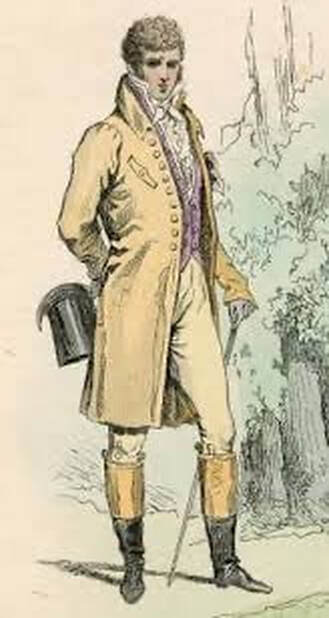
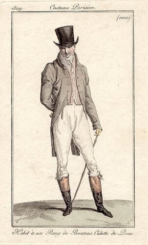
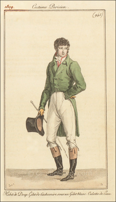
If you’re interested in learning more from me you can check out my free guides How to Draw Hands and 3 Simple Steps to Stand Out Colour Palettes, or you can scroll through past posts to see more behind the scenes! 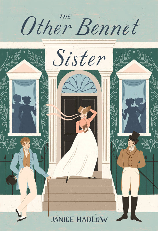 Hello friends! One of my goals this year is to get more work illustrating book covers, something that I’ve always dreamed of doing! I’ve been working to build up my portfolio by creating my own covers of some books that I love. Over the fall I listened to a really wonderful sequel to Pride and Prejudice called The Other Bennet Sister by Janice Hadlow. It follows the story of Mary Bennet through the original novel and beyond where she finds her own happy ending. I highly recommend it and the Audible narration was great if you like to draw and listen like I do! I finally had a chance to work on the cover over the last couple of weeks and I shared a quick screenshot of my sketching process over on Instagram the other day. It turned out to be my best performing story ever! Apparently the combo of dapper regency gentlemen and sharing about my art process is a winner. So today I thought I’d expand on that fun little story and share more about the unglamorous reality behind my sketching process. I hear from a lot of people who feel discouraged because their sketches don’t look polished and pretty, or worse yet Instagram worthy. But the reality is that those things aren’t important. Sketching is for working out ideas and that is a messy and sometimes confusing process. I often have to draw something over and over again until I get the feel for it. In fact, the sketching phase for me is often the most brain boggling and time consuming part of the creative process. But it's one of the most important parts as well and so satisfying when you end up with a finished product that you love. That said, let’s dive into my sketching process for this mockup cover. 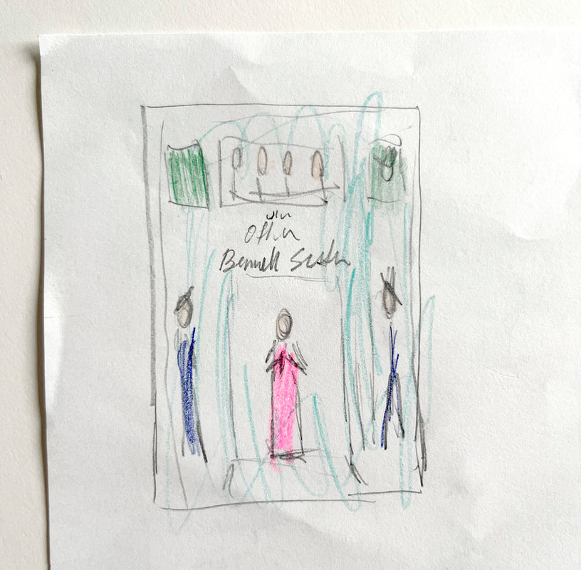 Ta-da! Here’s my first sketch. Absolutely beautiful isn’t it? My daughter thought so and decided to colour it in. I usually do quite a few of these small thumbnail sketches first to test out ideas and layouts and then I’ll pick one to move forward with (I’m going to share more about the ideation process in a future post so keep an eye out!). These thumbnails aren’t meant to be exact guidelines. They're more like quick notes, meant to get the gist of the idea out quickly. The next step is a very rough full sized sketch. Below I’ve clarified the layout and sketched in the general shapes of where things will go. Notice that I haven’t started adding any of the details yet. We don’t want to start painting the house before the walls are built! 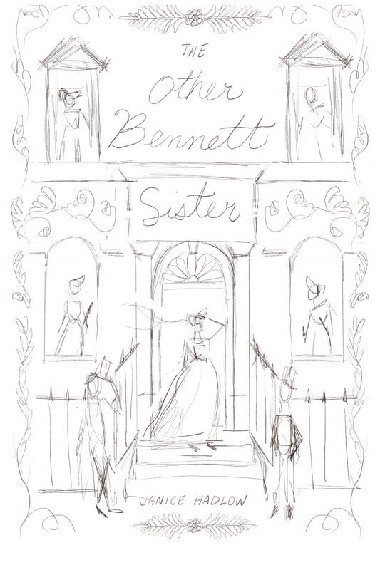 Please ignore my misspelling of Bennet! Once I have the layout nailed down I start clarifying the details in layers. I’m going to focus here on the two dapper gentlemen in the front. Unless it’s very simple, I don’t usually just draw something once and be done with it. I do a few versions. This helps me warm up and get a feel for the subject, then I choose the best version to move forward with. Here are a few versions of some regency gentlemen that I sketched out. I looked at some vintage fashion plates from the era to get a sense of what these fellows would be wearing and how they might be posing. 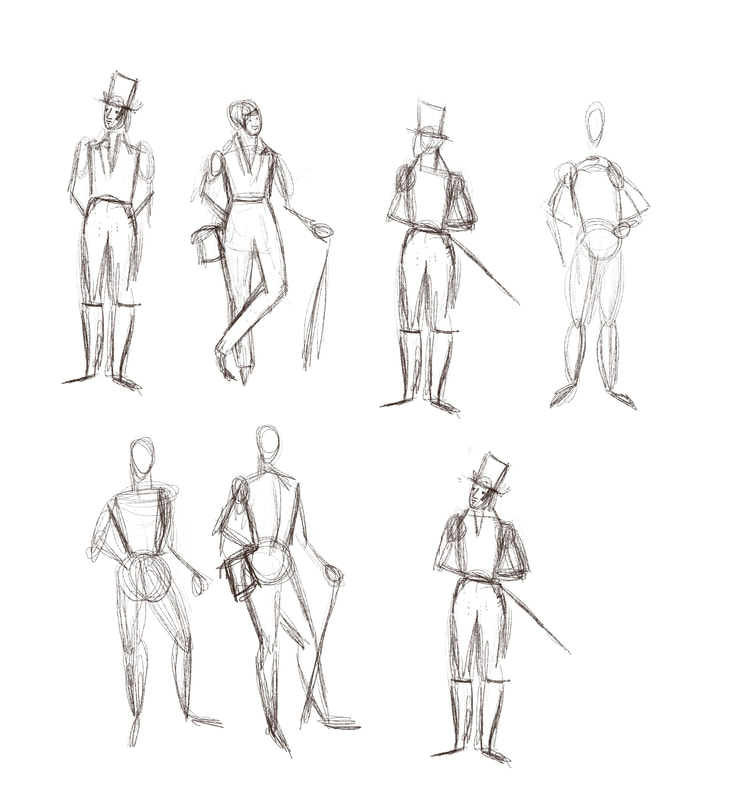
I decided to go with the two poses below because they best represented the characters' personalities and worked well together in the composition as a whole. You can see on the left sketch especially how I built these figures off of simple stick figures. See how rough my lines are? we're not aiming for perfection here. I usually scribble my pencil around a lot until I hit the right spot. 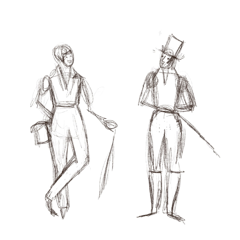 Next I start clarifying the sketch even further and here I’m focusing on getting the underlying structure of the body shapes correct so that the clothing will go on nicely and nothing looks weird or out of place. I work in Procreate on the iPad so I can lighten my under layers as I go and use them as a reference. If you don't have an iPad you can also use tracing paper, a light box or window, or gently erase your lower layers to lighten them. 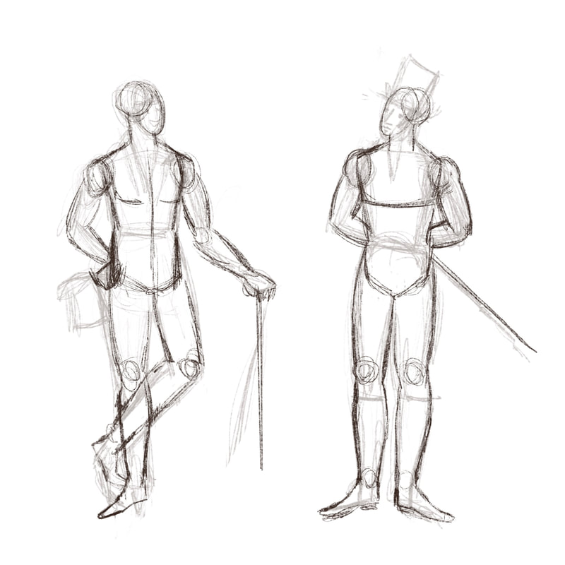 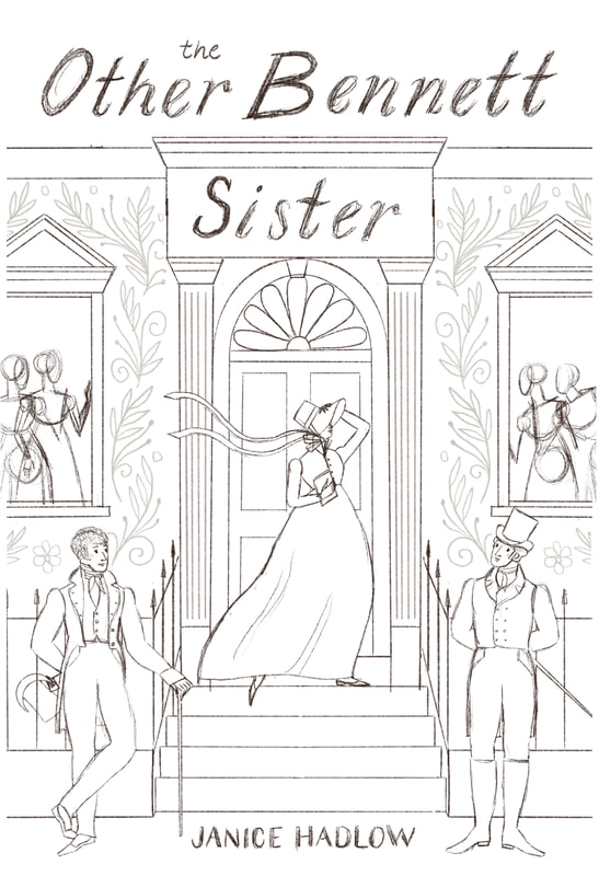 And here are the gentlemen in my final sketch. The last part of the process is where I focus on adding all of the details that make the sketch actually look like something. I feel like a lot of people just start drawing this final sketch phase first and then get frustrated when things aren’t going the way they’d hoped. The layout isn’t right and the elements are lacking finesse. I’m all for quirkiness in my illustration work but not when it compromises the overall foundation of the work. I know that not everyone works this way and that is totally fine. This is just the way that I’ve found works best for me. If you're struggling with your sketches I’d encourage you to try this technique out and feel free to change things up and try new things until you find the process that works best for you. If you enjoyed this behind the scenes you can keep up to date with future posts, products and other art news by signing up for my newsletter here, you'll get a copy of my free colour guide in the process! Thanks for reading! 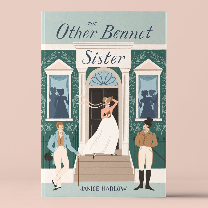 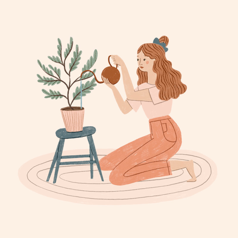 Hello friends! In my last post I shared a little bit about how I approach drawing by focusing on the shapes of the subject rather than the subject itself (go check it out if you haven't already). This week I thought I would share a little bit more about how I use that approach to tackle drawing complex subjects like animals and people, and the three main steps I go through to get to my final drawing. Step 1: Rough (The MOST important step in my process) As I said before, it starts by changing the way we see and looking for the basic shapes of the object rather than the thing itself. When it comes to drawing animals and people those basic shapes are usually circles, ovals or rectangles for the head and torso followed by lines, slim ovals or sometimes other shapes to indicate limbs. I like to think of these basic shapes as landmarks that help me lay out the structure of the subject before I go into too much detail. Because this is just a rough layer you can make adjustments as you go and not worry about getting it perfect right away. (you should see some of my sketches, they’re a complete mess!) Step 2: Refine Once (and only once!) you’ve got your rough structure laid out. It’s time to refine your sketch. Clean up any messes and start to clarify the lines. We’re looking for a basic line drawing of the subject without details at this point. In the image below you can see that I've lightly sketched out some circles to help me locate the hips, chest, head and shoulders and I've used lines to indicate the leg and arm position as well as the curve of the back. Then I've added oval shapes to clarify the limbs and started to refine the outline of the body. 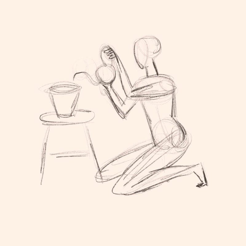 Step 3. Details Now is the time to finally add the fun stuff. Facial features, hair (or fur!) clothes or any other features that aren’t really important to the basic structure. This is where you can start to add your own flair to the drawing so have fun with it! 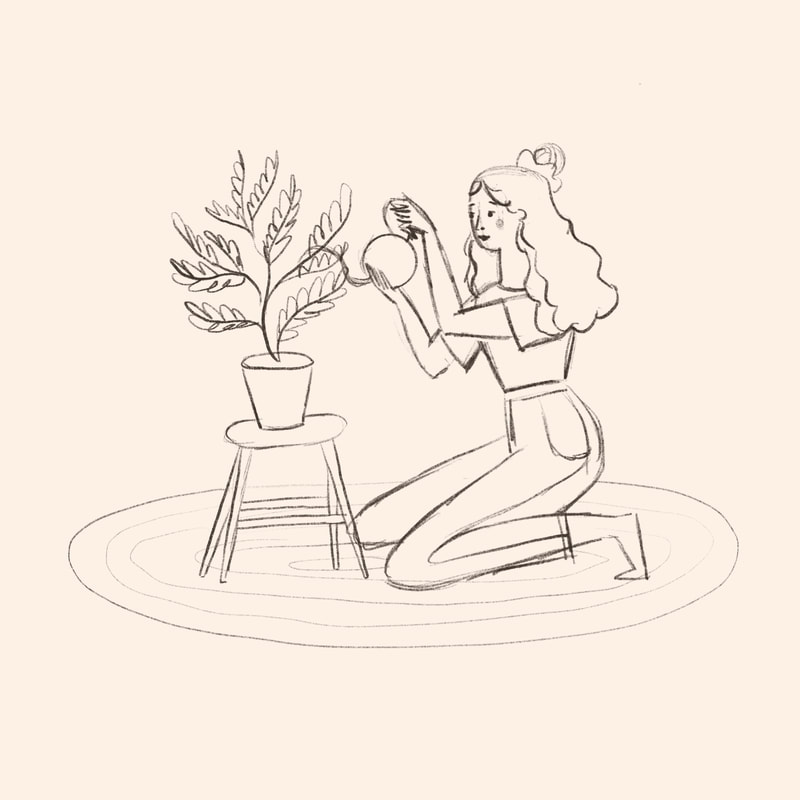 Tip: If you want to draw something complicated and don't have your own reference photos, you can work from multiple sourced photos until you feel comfortable with how the structure works and then create your own pose and work from there. As with all things this method takes practice but is totally worth trying out and you’ll feel great knowing that you’ve drawn something totally unique to you! I've done this below with these foxes. The first few are drawn from reference photos that I found online so that I could get a feel for how the fox looks and moves. In the sketches further down the page I've taken what I learned and started changing the positioning to make the drawings my own. Can you see how I've broken the fox down into basic shapes first using circles for the head, shoulders, hips and tail? Then I've just filled in the body and neck with connecting lines. 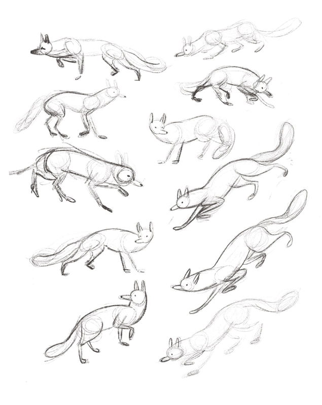 If you're interested in learning more about drawing people specifically, my online course, Draw Simple Figures delves deeper into this process and so much more. Learn more about the course here.
 I stumbled across a quote the other day from French Impressionist painter Claude Monet. He said: “To see we must forget the name of the thing we are looking at.” What he meant by that was that rather than painting (or drawing) our subject, along with all of our preconceived ideas about what that subject should look like, we should try looking at it objectively, seeing it only as a series of interacting shapes and colours. By doing this we can more accurately portray what we are seeing. I was particularly drawn to this quote because, while of course there are many many diverse ways of drawing and making images, this is one that I use a lot in my own work. I find it especially helpful when I'm drawing complicated things that I’m not that familiar with and I need them to be recognizable and somewhat realistic (for me that's usually animals and flowers). It’s easy to get caught up in the subject we’re drawing and decide subconsciously what the proportions are supposed to be or how each part relates to another based on previous knowledge rather than actually seeing what is in front of us, but this, for me at least, often ends in frustration. It’s not our fault that we do this. It’s just how our brains work. Filling in the blanks with previous knowledge in an attempt to make sense of things. In his book Color: A Workshop for Artists and Designers, David Hornung calls Monet’s concept “Retinal Painting”. He says “To surrender completely to visual sensation feels out of control at first. Most people find it hard to overcome the visual habit of imposing “what they know” about a subject upon what they are actually seeing.” So how to do it? Practice of course! As with anything, we need to dedicate the time to get better. Aside from that, here are some quick tips on how you an incorporate this idea into your own work. Start with the largest general shapes (this can include negative space) and either sketch them out or block them in with large areas of colour. Pay attention to how they relate to each other and try to capture that as well. Remember, don’t focus on the subject, just on what you are actually seeing. Your basic shapes will act as a general structure for the rest of the drawing. Don’t get caught up in adding too much detail to one area and not another. It’s important to build the work up in even layers of detail. This will create cohesion in the piece. Once you have your basic shapes laid down you can start adding in your own flair and style with each new layer, feeling confident that you’ve got a sturdy structure in place. Have you ever tried focusing on just shapes in your drawing? I highly recommend giving it a try! -Meghann  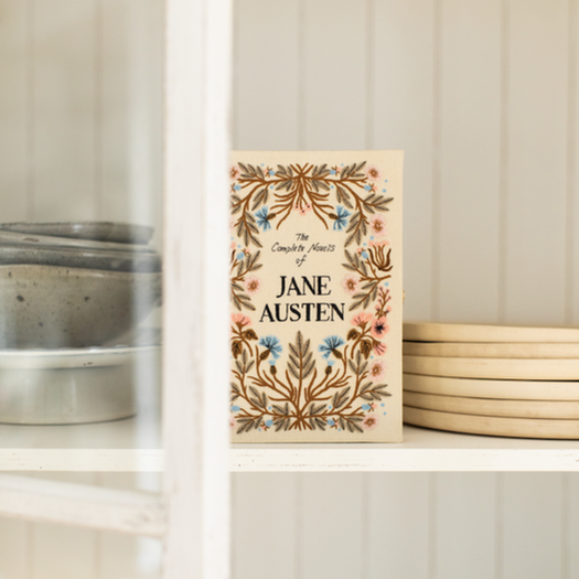 I'm so excited to finally share a new collaboration with you today! Last Spring I had the pleasure of illustrating three Jane Austen covers for French luxury brand Olympia Le-Tan. Books you might think? Nope! These are limited edition, hand embroidered clutches, book shaped purses! How fun is that! You might know that one of my big dreams is to illustrate a Jane Austen novel so of course I was over the moon for the opportunity to illustrate these beautiful clutches. The Complete Novels of Jane Austen and Sense and Sensibility are available now and I can't wait to see how the third book, Persuasion, turns out! 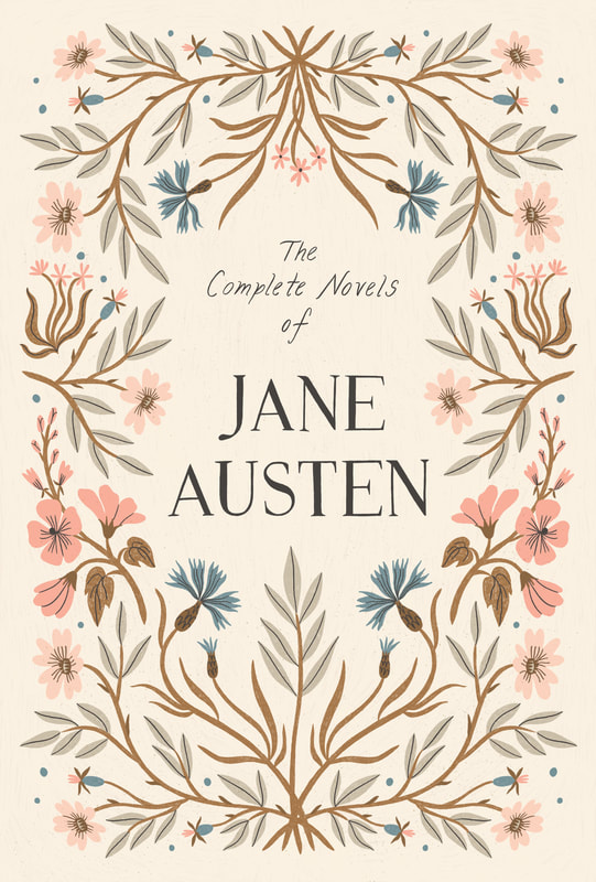 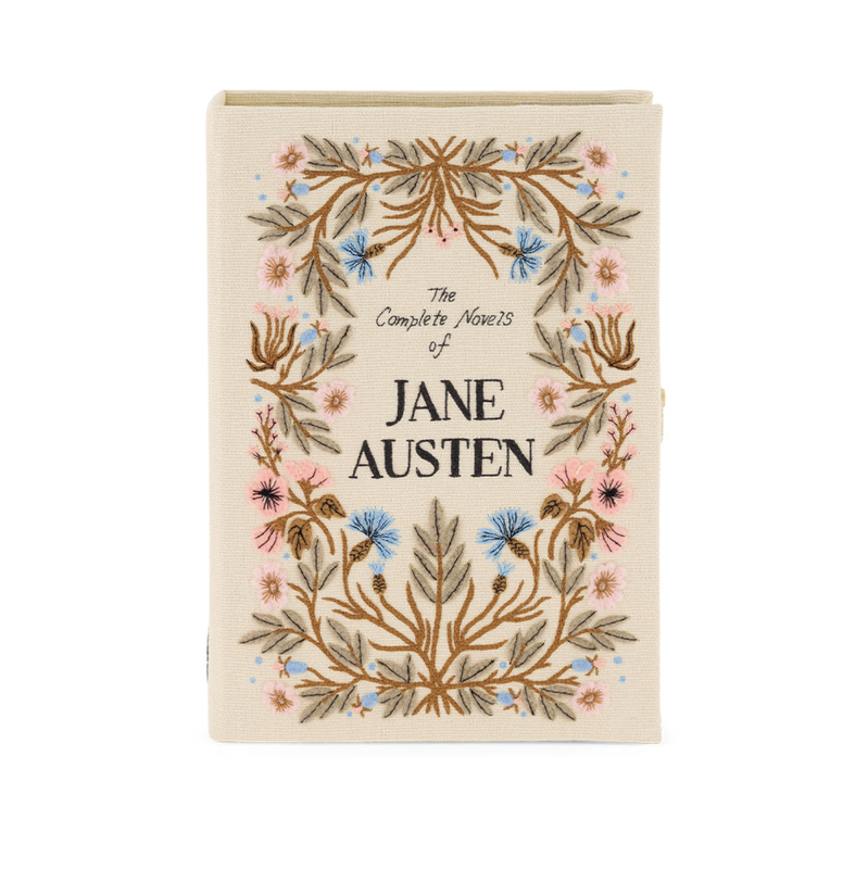 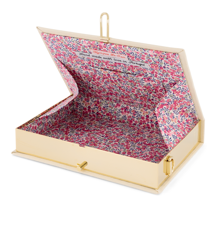 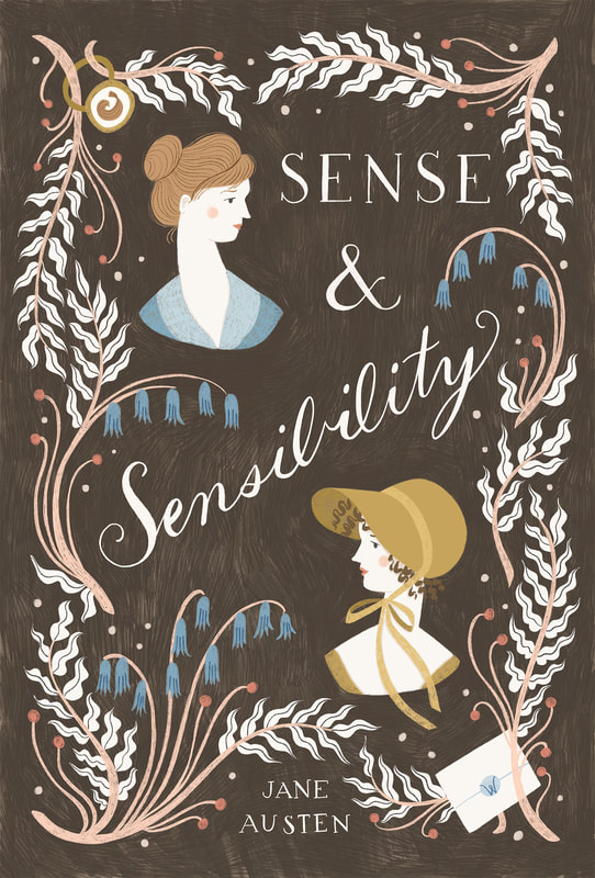 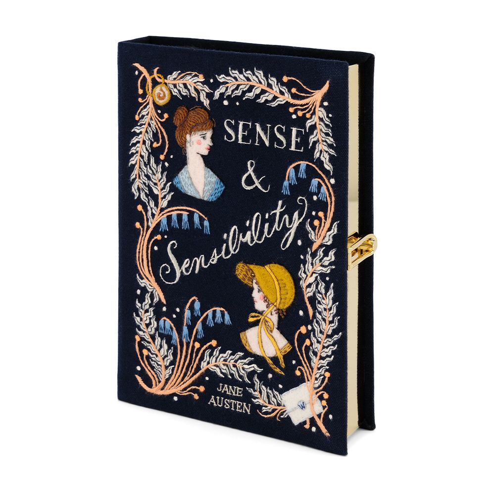 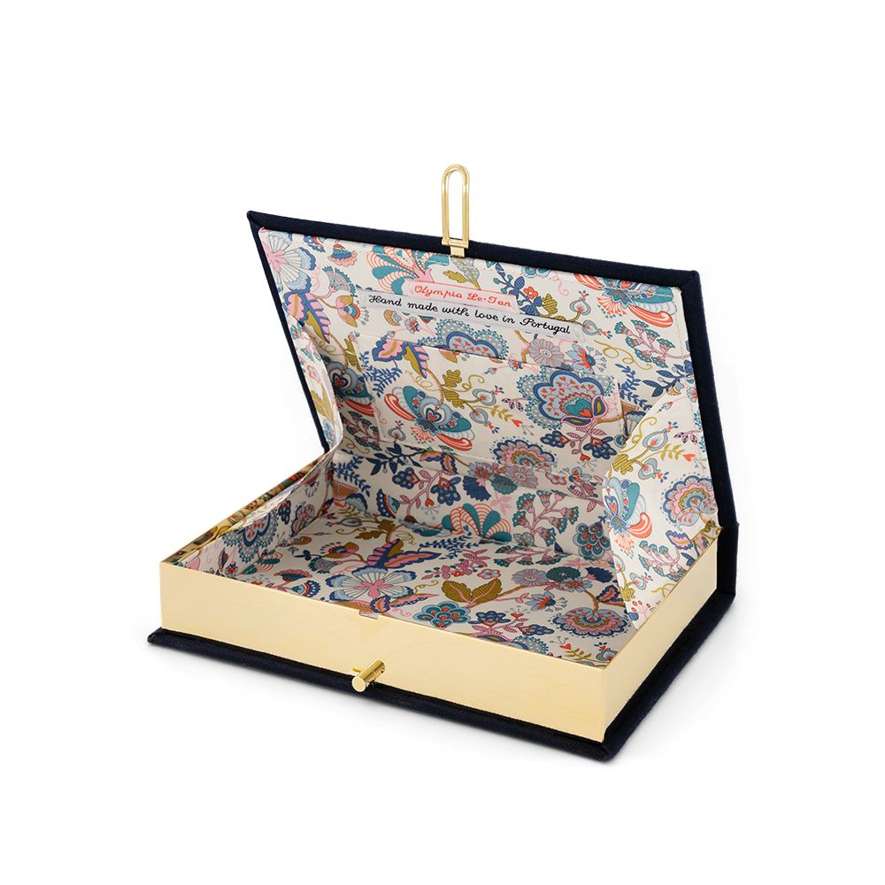 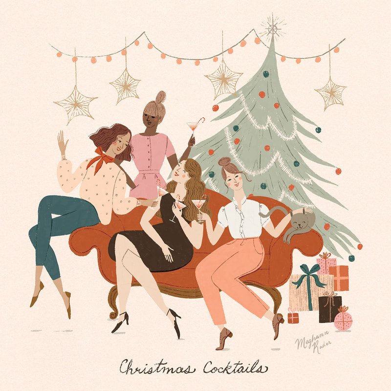 Hello Friends! Happy holidays and I hope you’re having a lovely December. This month I worked on a couple of pieces for my agent Jehane’s 12 Days of Christmas event on Instagram. I thought it would be fun to go behind the scenes and share a bit of my process for making this piece inspired by the prompt "Christmas Cocktails." As you might have already guessed, I love drawing people and so rather than focusing on just the cocktails I thought it would be more exciting to draw a cocktail party. After some time spent playing around with the layout this is the final sketch I ended up with. 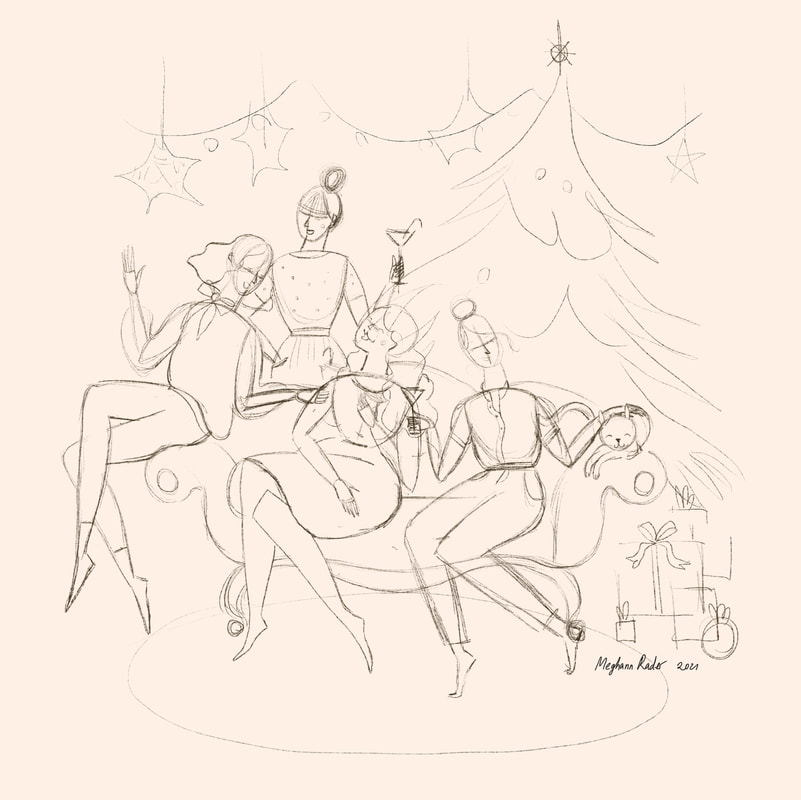 My initial rough sketch I usually change my mind a lot when it comes to colour and so I like to plan those out in advance. This helps me get a general idea of how everything is going to look as a whole and then I don’t have to spend time fiddling and changing things after the fact. I usually create a colour rough by just blocking out various colours on separate layers in Procreate and then experimenting with various combinations and making small adjustments here and there. A few things I’m looking for here are an overall balance and harmony within the colour palette and whether there is enough contrast. Contrast will help make everything pop where you want it too. Squinting is a great trick to tell if there's enough contrast but because I’m working on the Ipad I'll sometimes just desaturate my image, then I can clearly see where I need to make adjustments. In this case you can see below that I could have added more contrast between the tree and the hair of the woman petting the cat which I ended up doing in my final piece.
Once I had my colour figured out I started on my final image. If you’ve taken my Draw Simple Figures course you’ll know that I like to build up my sketches in layers, and I do the same with my final artwork as well. Usually I like to lay in all of my solid colours first and then add all of the little details last. I just find that this helps me keep the whole piece balanced. 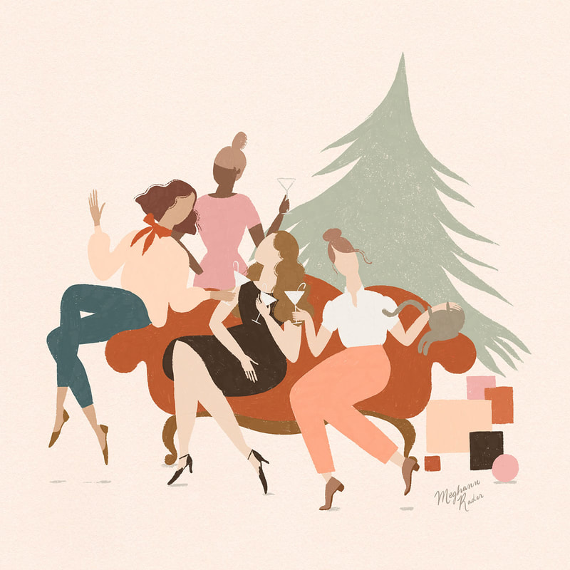 Final with just the solid colours laid down And here is the final image with all of those fun details brought in to make everything come alive! 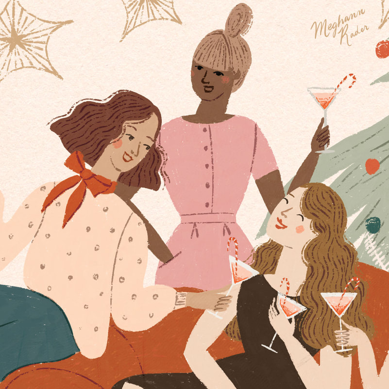 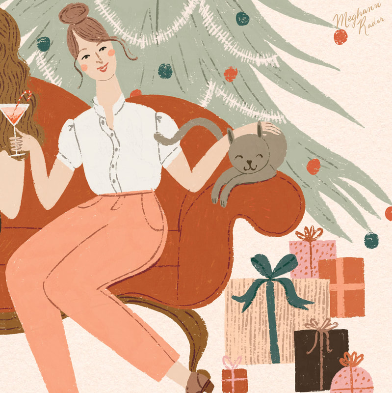
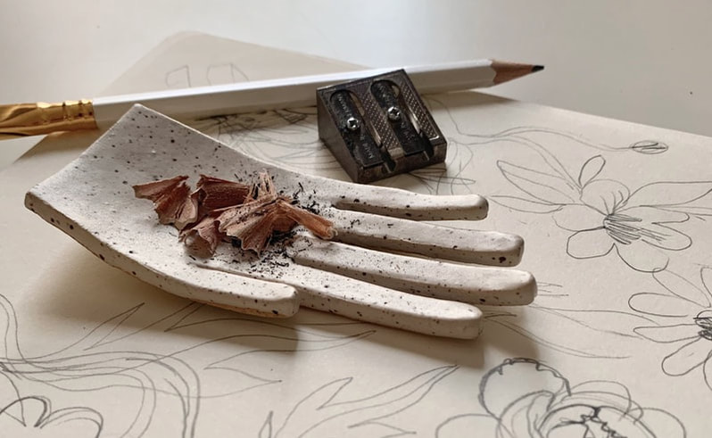
I hope you’ve enjoyed this little behind the scenes. I can't wait to share more of what I've been working on lately with you in the new year! All the best, Meghann 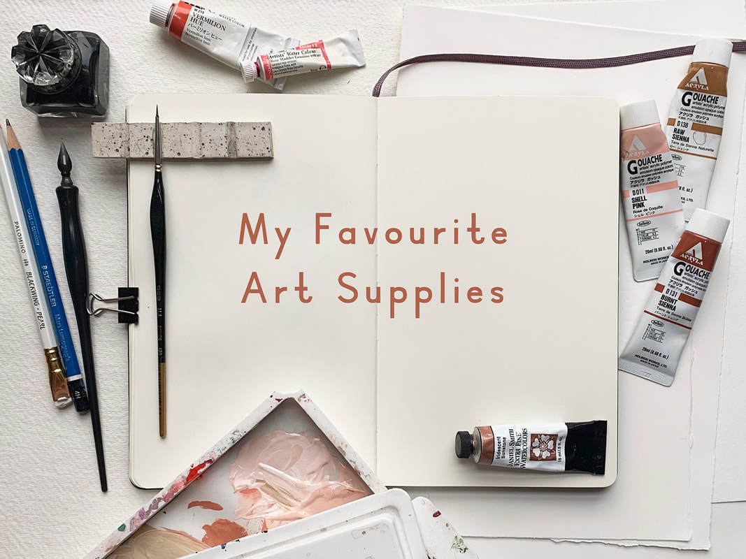 Some of you might know that after finishing art school I worked at a local art supply store for several years. While there I learned A LOT about all of the various supplies out there. I still love talking about art supplies and will take every opportunity to do so. So in my attempt at a holiday gift guide of sorts I’ve compiled this list of supplies that I love and use most often. It's certainly not a comprehensive list (although I did get a bit carried away with the descriptions!) but hope you enjoy reading through and maybe you'll find something fun for your wishlist! Keep in mind that these are the tools that I’ve found work best for me. There are countless other tools out there that are just as wonderful and if you have anything you’d like to add to this list please share in the comments! I’m linking to my favourite local art store where possible and I would encourage you to shop small and look for these products at your own favourite locally owned business. 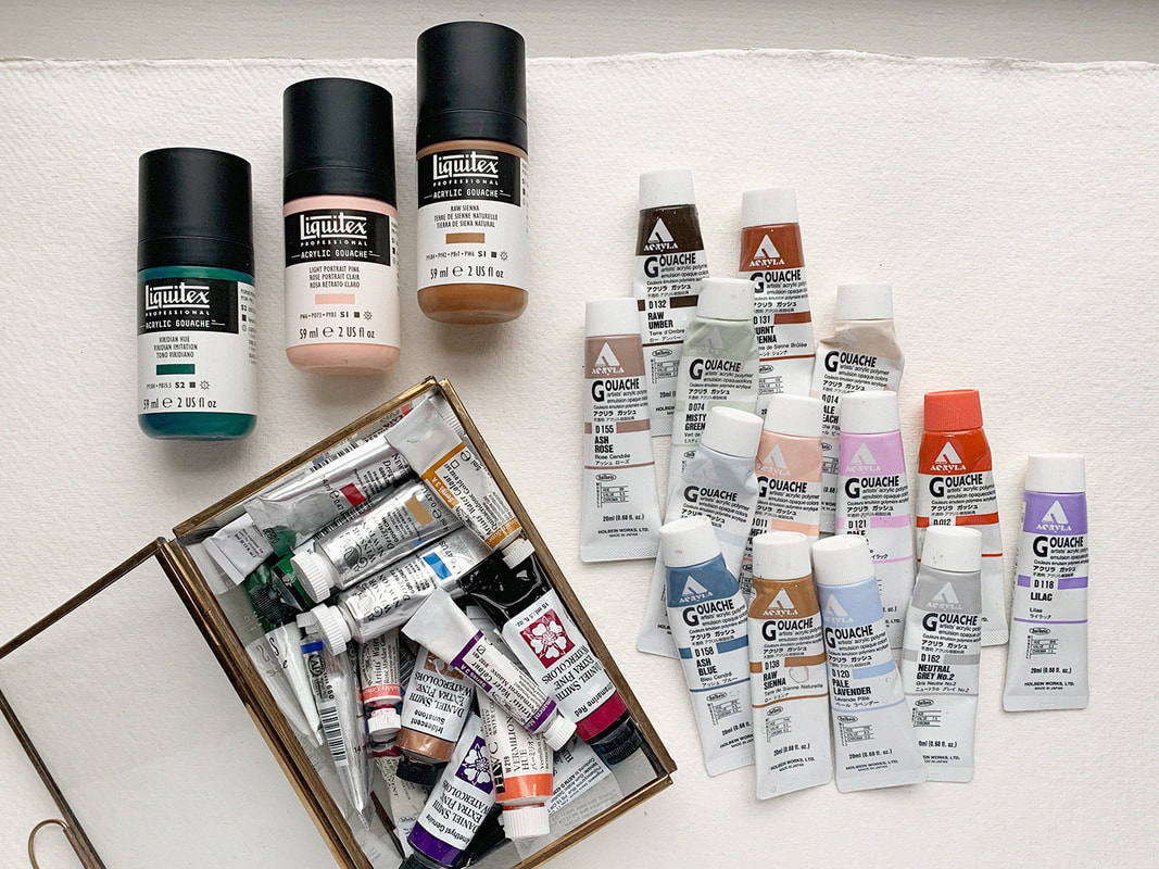 GouacheGouache is basically an opaque watercolour paint. I love working with it because it has a beautiful silky matte finish and it’s much more forgiving and easier to control than regular watercolour. Traditional gouache is water-soluble and you can re-wet it after it dries. So if you’re used to using watercolour and want to give gouache a try, a traditional water soluble gouache like Winsor & Newton would be a great way to dip your toe (or brush!) in. You can also use traditional gouache in combination with your existing watercolour paints which is handy, especially if you just want to start by incorporating a few colours here and there. When I first started using gouache I was more comfortable with acrylic paint which remains solid once dry, allowing for layering without affecting the paint underneath, so I opted for acrylic gouache which has those same features. If you go this route, I’d recommend getting a Stay-Wet Palette as well. They’ll help prevent your paint from drying out in-between uses. I'll talk more about them below. Whichever your preference, I definitely recommending giving gouache a try. It may take a bit but once you get the hang of it I know you will love it! For those who've been wondering how to pronounce this funny looking word, I've heard it said a few different ways, but the way I learned and have always known it to be is "Gwash", as in the word "wash" with a G sound in front. Acryla Gouache Liquitex Acrylic Gouache Winsor & Newton Designers Gouache (Water soluble) WatercolourI don’t use a ton of watercolour but I do have a few go-to favourites which I’ll share here. As with most paint, watercolour is available in both student and artist quality. The difference being the amount of extra “filler” to pigment ratio. The pigment being the expensive part . Student quality paint has a much higher amount of filler which makes it less expensive. It also means that the colours are less vibrant both on their own and even more so when mixed, so the end result is often not great. Many beginners give up after their first few attempts, mistakenly thinking that they just aren’t good at painting, when in fact it’s the low quality paint that is making things difficult. So, If you can, I would always recommend investing in artist quality paint when possible. If you want to save some money with student quality paints there are a few things you can do. Winsor & Newton’s Cotman watercolours are a higher end student quality paint that is a great option. You can also mix things up by purchasing your whites, browns and other neutrals in student quality and splurge when you can on the more expensive bright colours which have a much higher pigment load and will go a lot further in use as well as more vibrant mixing. Winsor & Newton Watercolour (Artist Quality) Daniel Smith (Artist Quality) - Offers a huge variety of really interesting colours unique to this brand. Holbein Watercolour (Artist Quality) Cotman Watercolour (Student Quality) 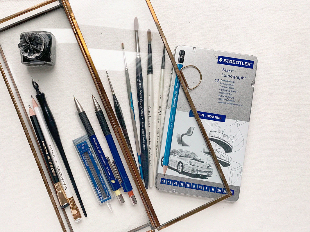 Brushes While I’m pretty particular about paint, I’m not nearly as particular about brushes. Even old splayed brushes have their uses in creating beautiful texture. For Gouache I prefer using inexpensive mixed media brushes like Robert Simmons or synthetic watercolour brushes like W&N Cotman brushes because I find the gouache tends to be a bit harder on the brush and the sturdy synthetic fibre holds up better, I also don’t feel as bad about replacing them more often. For watercolour I’d recommend using a natural bristle brush because all of the little micro imperfections in the fibre allow the brush to hold much more water and release it slowly over time, meaning you’ll have better control without the constant re-dipping. The natural curve of the fibre also makes a point that’s perfect for fine details, even with a large brush. Cotman Watercolour Brushes (Gouache or Watercolour) Simply Simmons Mixed Media Brushes (Gouache) H.J 170 Kolinsky Sable Brushes (Gouache or Watercolour) - Fine detailing W&N Professional Watercolour Sable Brushes (Artist Quality, Watercolour) Winsor & Newton Series 7 Kolinsky Sable Watercolour Brushes (Artist Quality, Watercolour) - A major splurge but these brushes have been known to last a lifetime and beyond. They are the best of the best. Sketching While the hot commodity in pencils these days is Blackwing, I’m not totally sold. They look great, but in my humble opinion they are basically just a regular 6B pencil in a nice outfit. I prefer my old Staedtler Pencils for sketching. That being said, I do like to throw a Blackwing into my photo’s every now and then for the pretty factor. I hope you have yourself a little laugh whenever you spot one in my photos from now on! Staedtler Mars Lumograph pencils Staedtler Mars Micro Mechanical pencils Blackwing pencils I also love using a dip pen for hand lettering. I have this set from Speedball Speedball Sketching Project Set 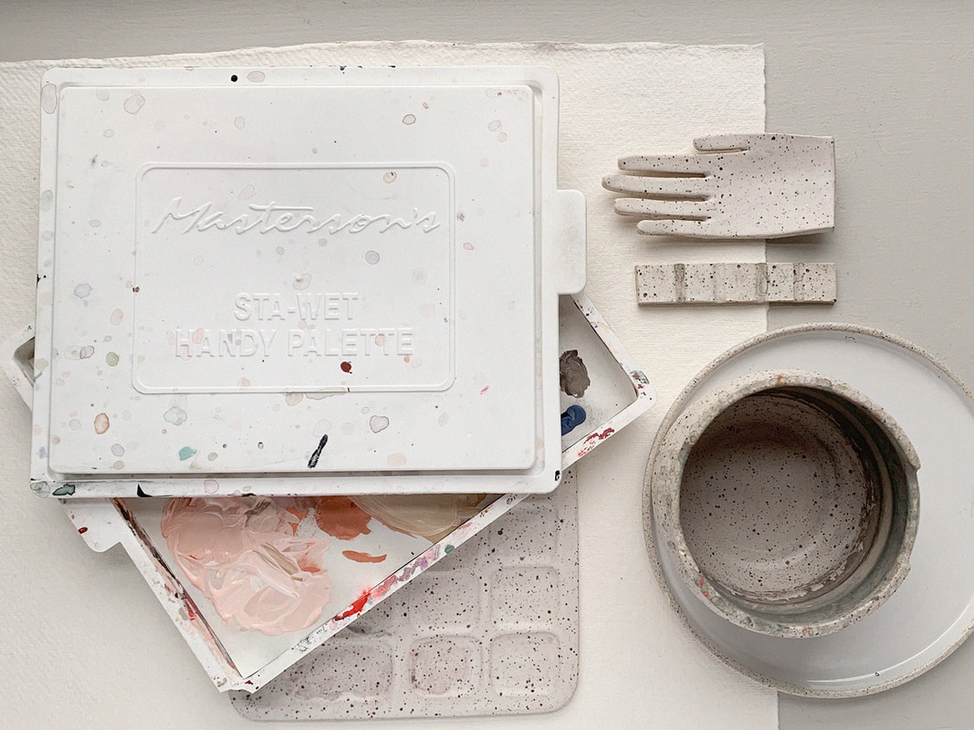 Palettes and Accessories Remember a bit ago when I said I love Acrylic gouache? The biggest complaint I hear from people against using it is that it dries too fast and therefore is a waste of paint. To that I say…Nonsense! You need a Stay-Wet Palette. I was first introduced to Say-Wet palettes when I used to take art lessons after school as a child. They would keep my precious acrylic paints dry all week long until my next lesson and I’ve been using them ever since. If you’re looking for something a little prettier, and dare I say Instagram worthy, then a beautiful ceramic plate is always great or if you want to splurge, Sugarhouse Ceramic Co. makes some very beautiful ceramic palettes and other studio supplies like painter’s pots and brush rests. Masterson’s Sta-Wet Palette Sugarhouse Ceramics Co 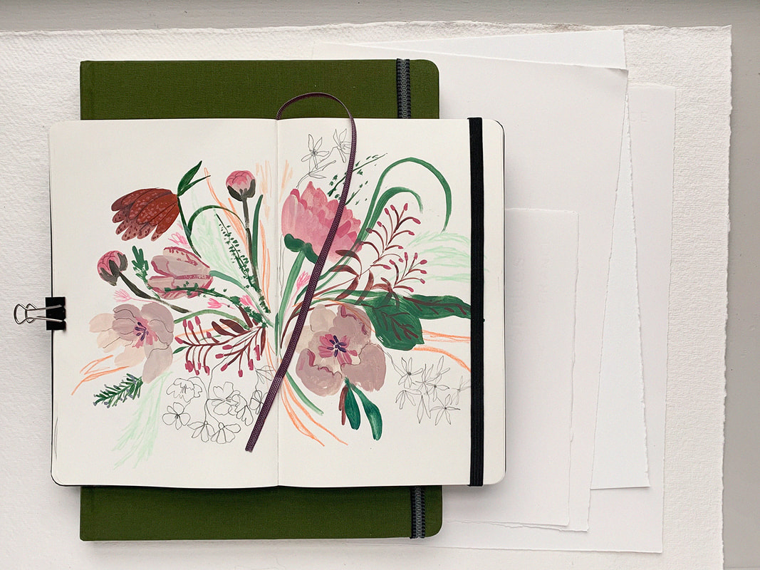 Paper and Sketchbooks When choosing a paper for illustration I’m always thinking about what is going to scan well. I look for smooth bright white paper that is thick enough to hold up to wet media and isn’t too absorbent, which causes the paint to bleed into the fibres rather than sit nicely on top of the paper. Arches Hot press is beautiful to work with but I also really like using Strathmore Mixed media pads or Canson XL Watercolour Pads because they’re a bit more economical for the way that I work. For sketchbooks I love using Moleskin as well as Global Art Hand Book Artist Journals which are very similar but have thicker paper and are slightly less expensive than Moleskin.
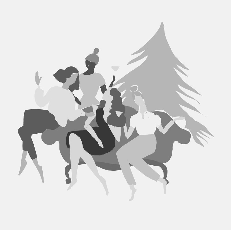
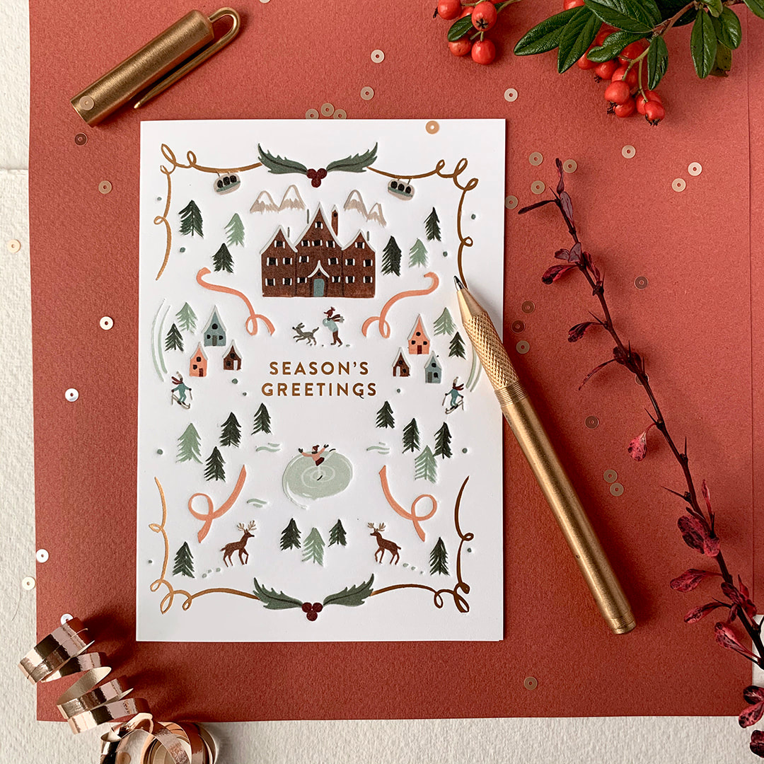
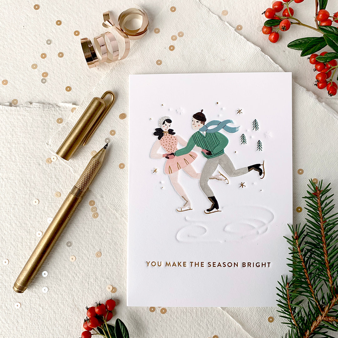
Arches Hot Pressed Watercolour Paper Strathmore 300 Series Mixed Media Pad Canson XL watercolour pad Moleskine Notebook Global Art Hand Book Artist Journals You made it to the end! Thank you for hanging in there. That is my list so far but it's just the tip of the Iceberg! In future posts I’ll be sharing more of my artsy favourites like all of my favourite digital supplies, books and online courses. Stay tuned! And be sure to comment below with you’re favourite supplies! Best, Meghann 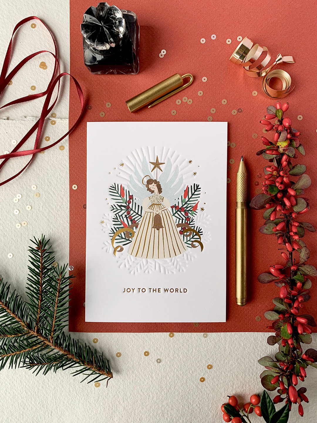 Hello friends! I'm so excited to share some new holiday cards I designed for Lagom Design that are now available over on their website. The more cards I design the more I fall in love with it. A well made card is like holding a tiny treasure. It's a keepsake and these ones are particularly close to my heart. I love Christmas! They are beautifully printed on quality card stock with blind embossing and gold foil detail to make them extra special. I hope you and yours enjoy them as much as I do!
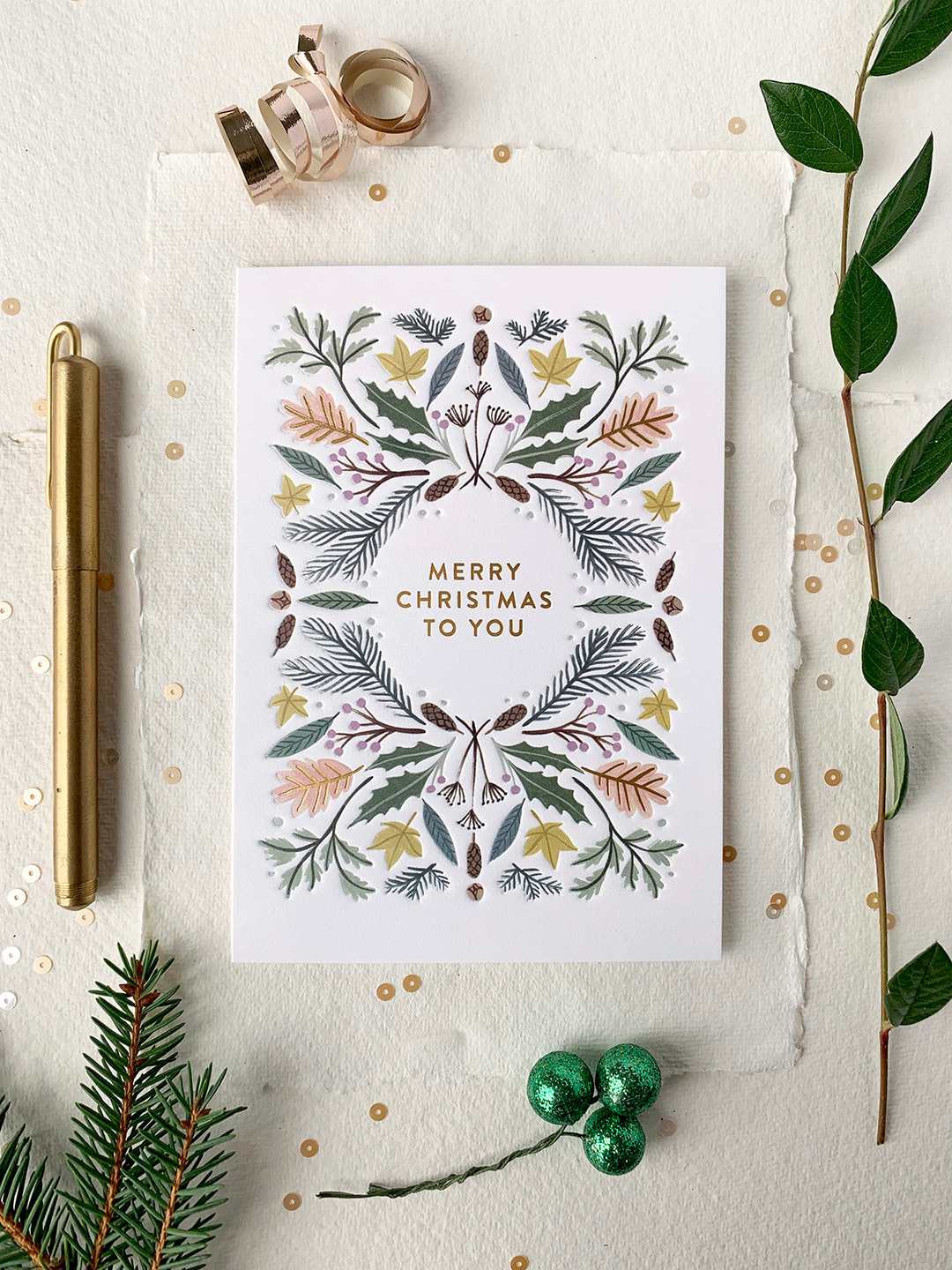 You can also check out my designer interview, The Magic of Small Things here on the Lagom blog.
All the best, Meghann |